Click, Apply, Smile
Redesigning a $150B Mortgage Experience
Before 2016, mortgage applications were complex and mobile-unfriendly. As lead designer, I reimagined loanDepot’s digital mortgage funnel for the nation’s #2 nonbank lender—making the process fast, human, and accessible across devices.
I was part of an ambitious project to redesign the mortgage application experience for loanDepot, the second-largest nonbank consumer lender in the U.S.
Confidential information in this case study has been omitted and obfuscated in compliance with the non-disclosure agreement. The information on this website is my own and does not necessarily reflect the views of my employer/client.
About loanDepot
Founded in 2010, loanDepot has funded over $150B in consumer loans and is the nation’s fifth-largest retail mortgage originator and second-largest nonbank consumer lender. The company operates 150+ locations nationwide with 6,400 employees, including 2,000+ licensed loan officers holding more than 10,000 active licenses.
“Many customers will give you one try and then give up when the design is too difficult or doesn’t satisfy their needs.”
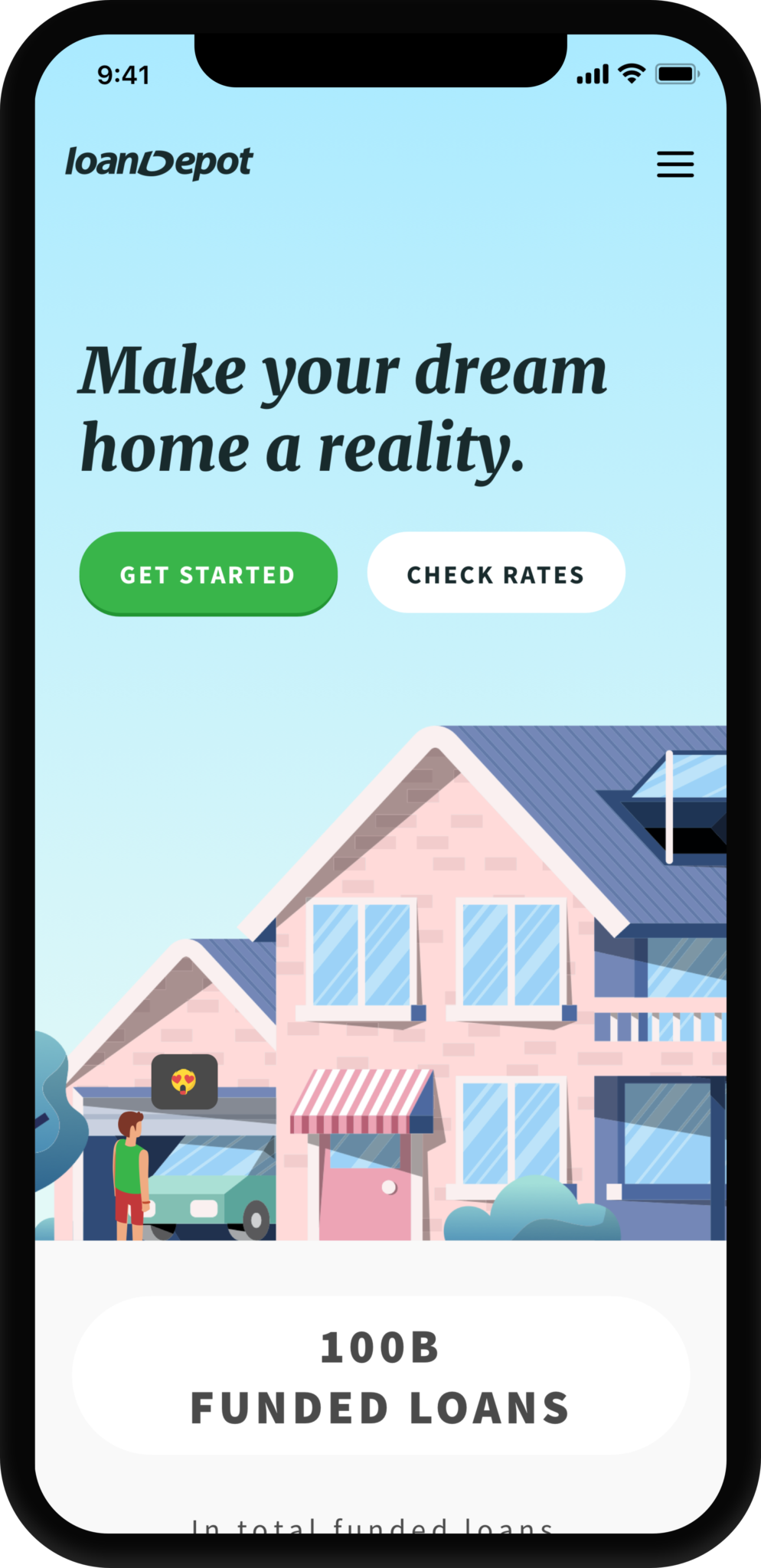
The challenge
The 2016 mortgage web app lacked a frictionless self-serve experience and wasn’t optimized for mobile. Automated ID and asset verification performed poorly, driving low conversion rates.
Frustration was widespread and trust declined. Customer support received frequent complaints from users stuck mid-application, many so discouraged they asked to have their data deleted.
My goal for the redesign was clear: make applying fast, simple, and enjoyable. I aimed to turn a tedious process into a confident, delightful journey that would also attract younger homebuyers.
Redesign goals:
1. Make the application effortless and engaging.
2. Build trust through empathy.
3. Show only purposeful, easy-to-digest information.
My role
I led the redesign of loanDepot’s online mortgage application, partnering with product managers and industry experts to improve completion and submission rates. Our team explored integrations with Mitek and Finicity to automate identity and asset verification, reducing processing time and cost per loan.
I also initiated loanDepot’s first company-wide design system, documenting modular components and establishing consistent UI and UX principles inspired by Material Design.
Early proto – Photo capturing with Mitek web SDK.
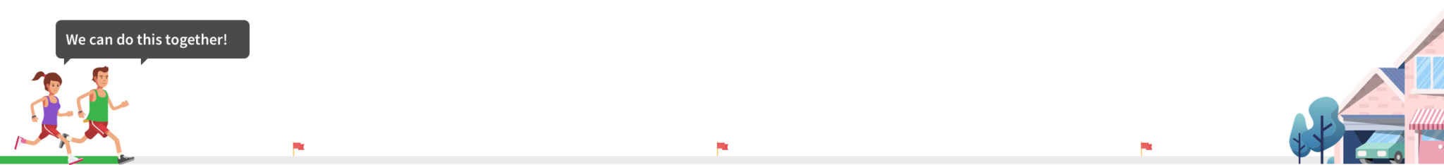
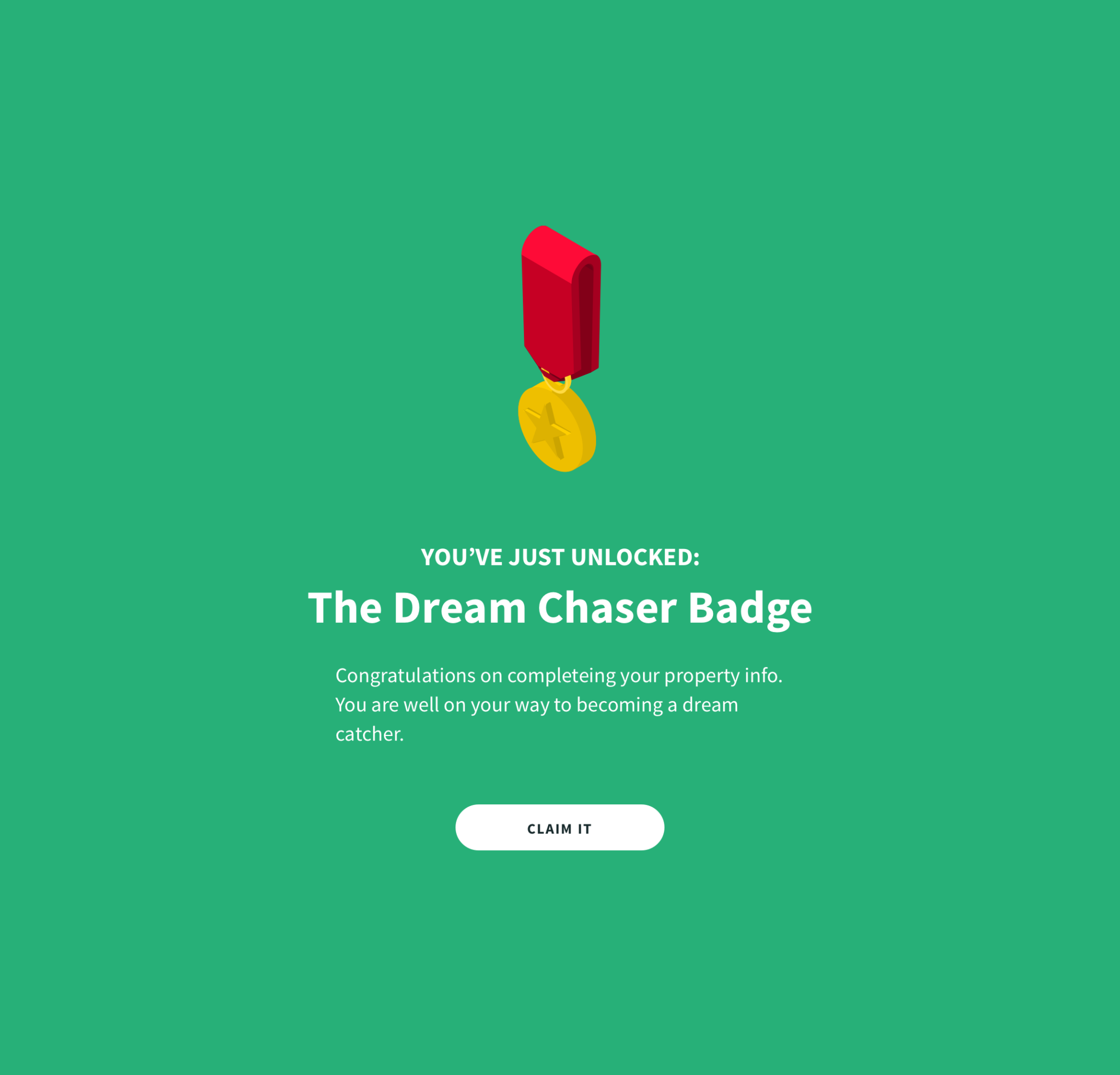
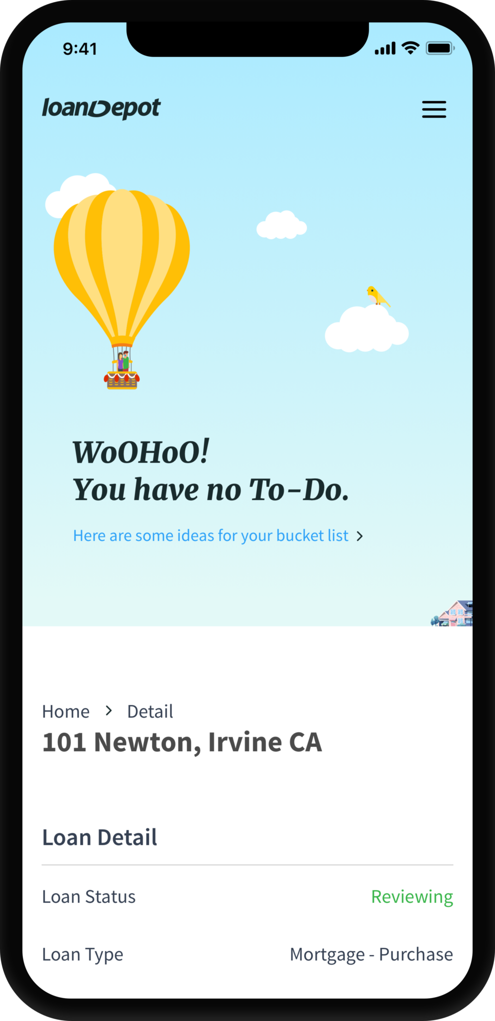
Design with emotion
Gamification guided my design approach. I added playful moments through illustrations, micro-interactions, and animations to enhance emotional engagement and visual appeal. This new approach required close collaboration with marketing to maintain cohesive branding and tone.

Progress indicator – sole borrower.
Progress indicator – with co-applicant.
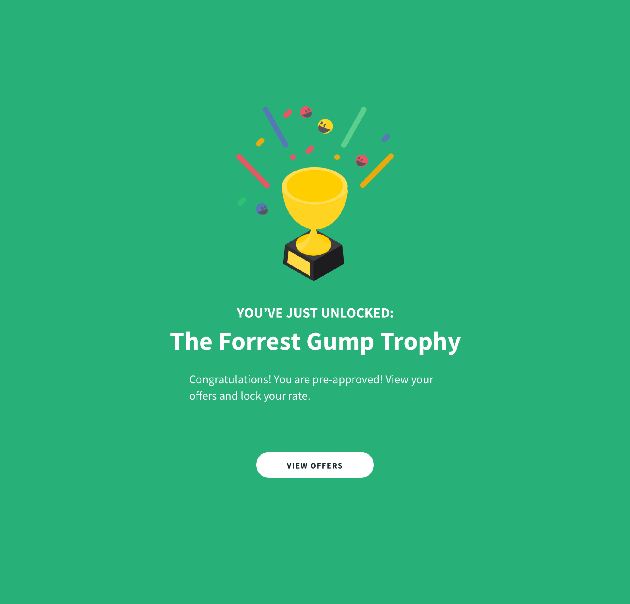
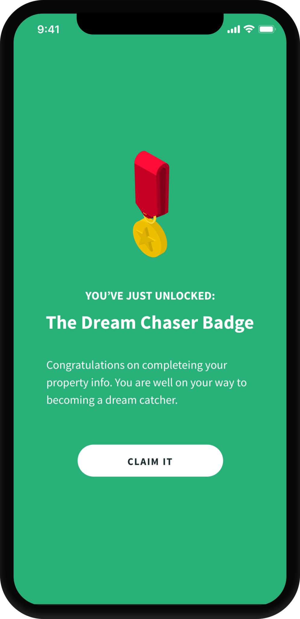
Save points.
From insight to design
I partnered with our Mixpanel analyst to analyze user behavior, map key flows, and identify friction points throughout the mortgage application journey. These insights helped us define measurable success metrics and prioritize design improvements that directly impacted conversion.
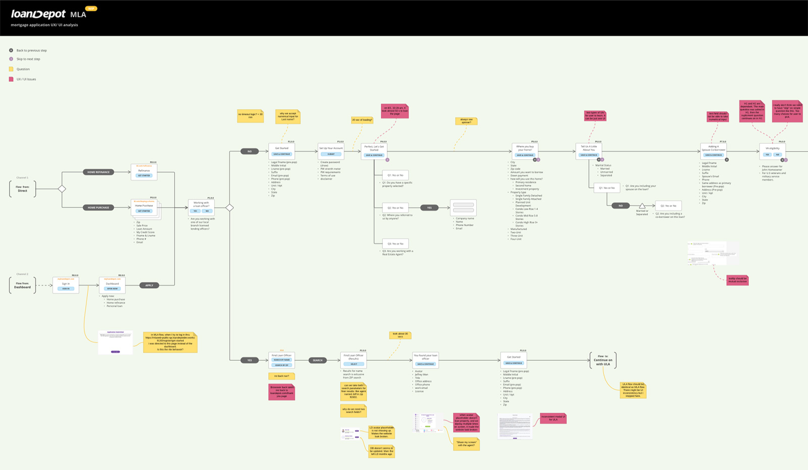
Info Architecture – UX Analysis.
Defining the problems
Users reported feeling overwhelmed by the website’s heavy use of brand colors (green and purple). The background video wasn’t optimized for streaming, and there was no clear visual cue for how to begin the application.
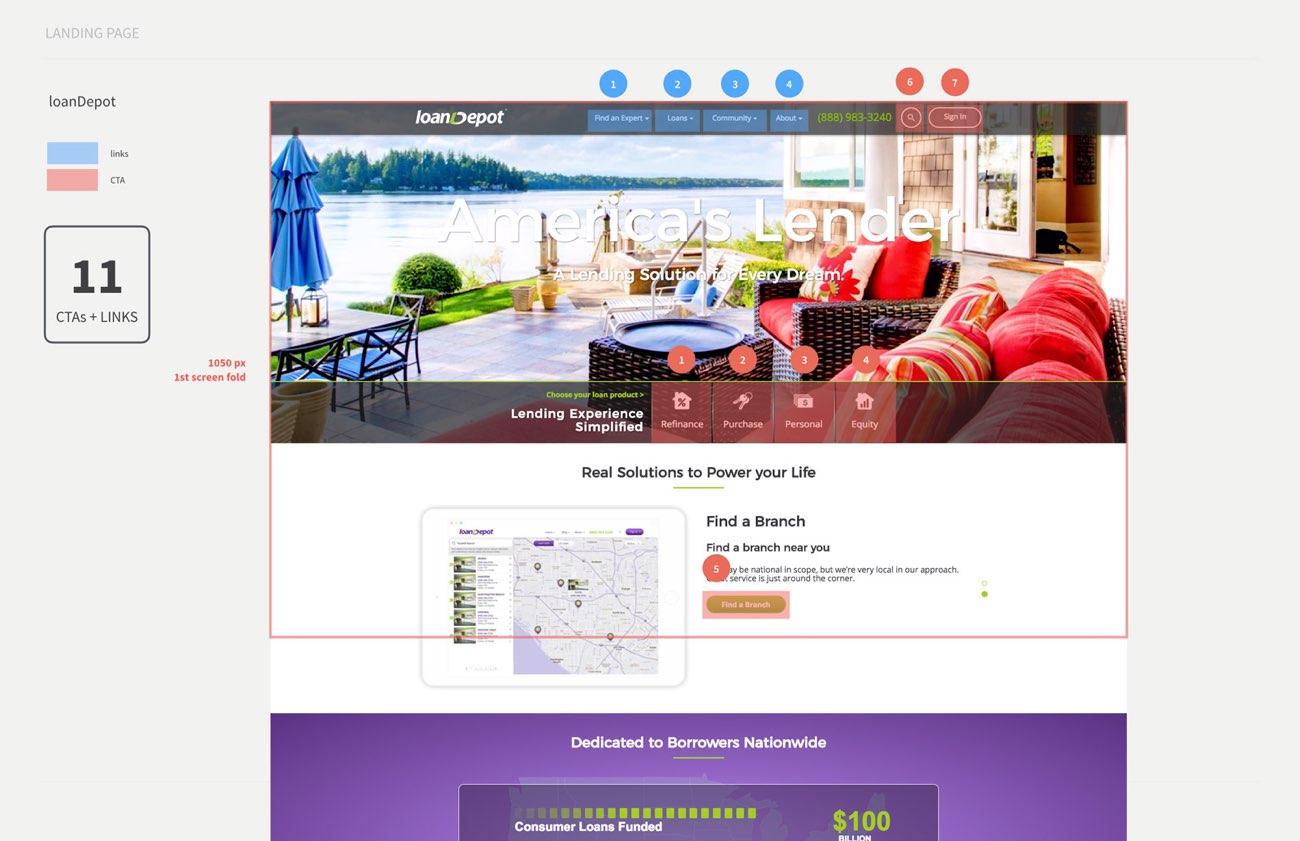
Decision Paralysis
Users spent excessive time comparing loan options. The abundance of CTAs and links created confusion, leading to hesitation and drop-offs.
Performance Issues
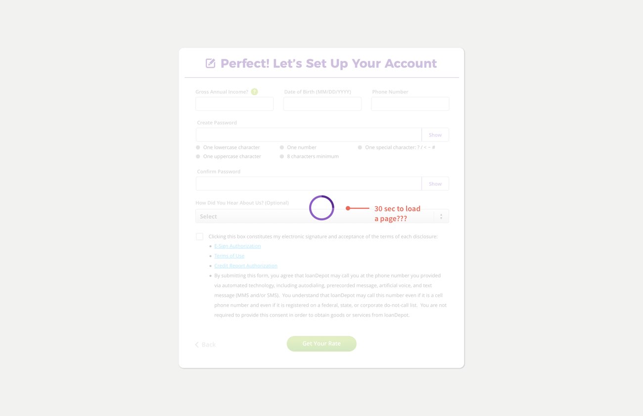
Slow load times frustrated users—page transitions could take up to 33 seconds. Many refreshed or abandoned the page, contributing to a high bounce rate.
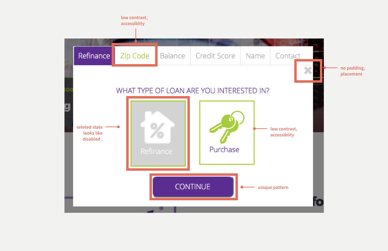
Accessibility & Aesthetic Gaps
Accessibility and contrast scores were low due to the overuse of brand colors. Users expected a cleaner, more readable interface that guided them forward with ease and confidence.
Thriving Under Constraints
The project began with a strong focus on usability and solid leadership support. But as interest rates climbed and the mortgage market slowed, resources became limited. I shifted my focus to optimizing the user experience and reducing development effort to lower the cost per loan.
During this time, I voluntarily spent weekends kickstarting our first design system, defining its philosophy, building reusable components for engineering, and uniting the team around a more efficient way to build.
Unifying the chaos
During the redesign, I faced pushback from PMs and engineers since multiple hardcoded components already existed across platforms. Achieving a unified system required alignment and commitment.
After aligning Product, Engineering, and Architecture, we agreed on one solution — a design system.
Top benefits:
1. Faster onboarding and shared knowledge
2. Lower development costs
3. Consistent, scalable design foundation
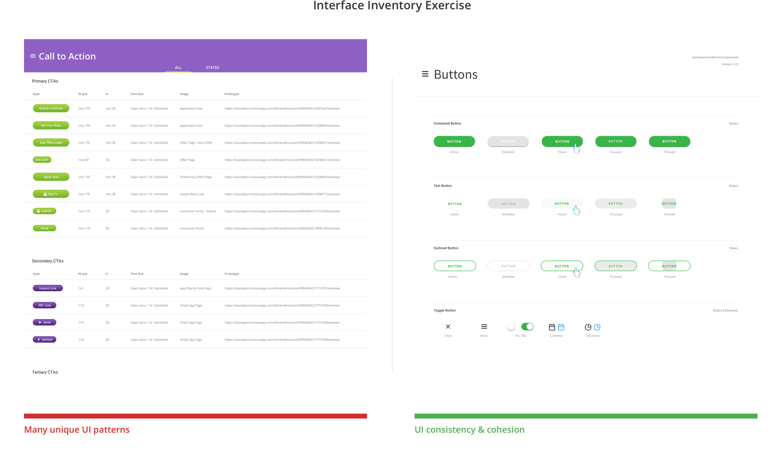
I went thru bunch of different products, captured unique UI pattern for all UI components.
Start with Whys
Early in my career, I learned that a defining trait of a strong UX designer is the ability to stay with the problem. By understanding user motivations, values, and behaviors, I could separate needs from wants and design pragmatic, high-impact solutions.
At the start of the redesign, I kept the conventional address form—five text fields plus a state picklist. This increased time on page and frustrated mobile users, who made up over 40% of our applicants. The added friction led to significant drop-offs.
Digging deeper into the user journey, I reframed the problem by asking key questions:
Q: Why are we asking for addresses?
Q: Why are users struggling with these fields?
Q: Why do we want to optimize this experience?
Q: How will users benefit from the solution?
Less is NOT always more
Even well-intentioned simplifications can create new usability issues. Through testing and iteration, I refined the address form to balance simplicity with clarity. The takeaway was clear: the obvious always wins.
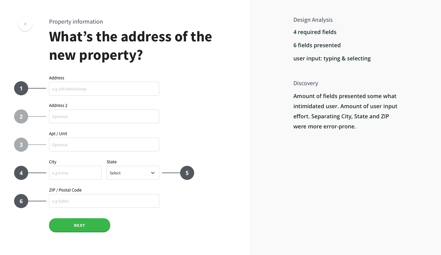
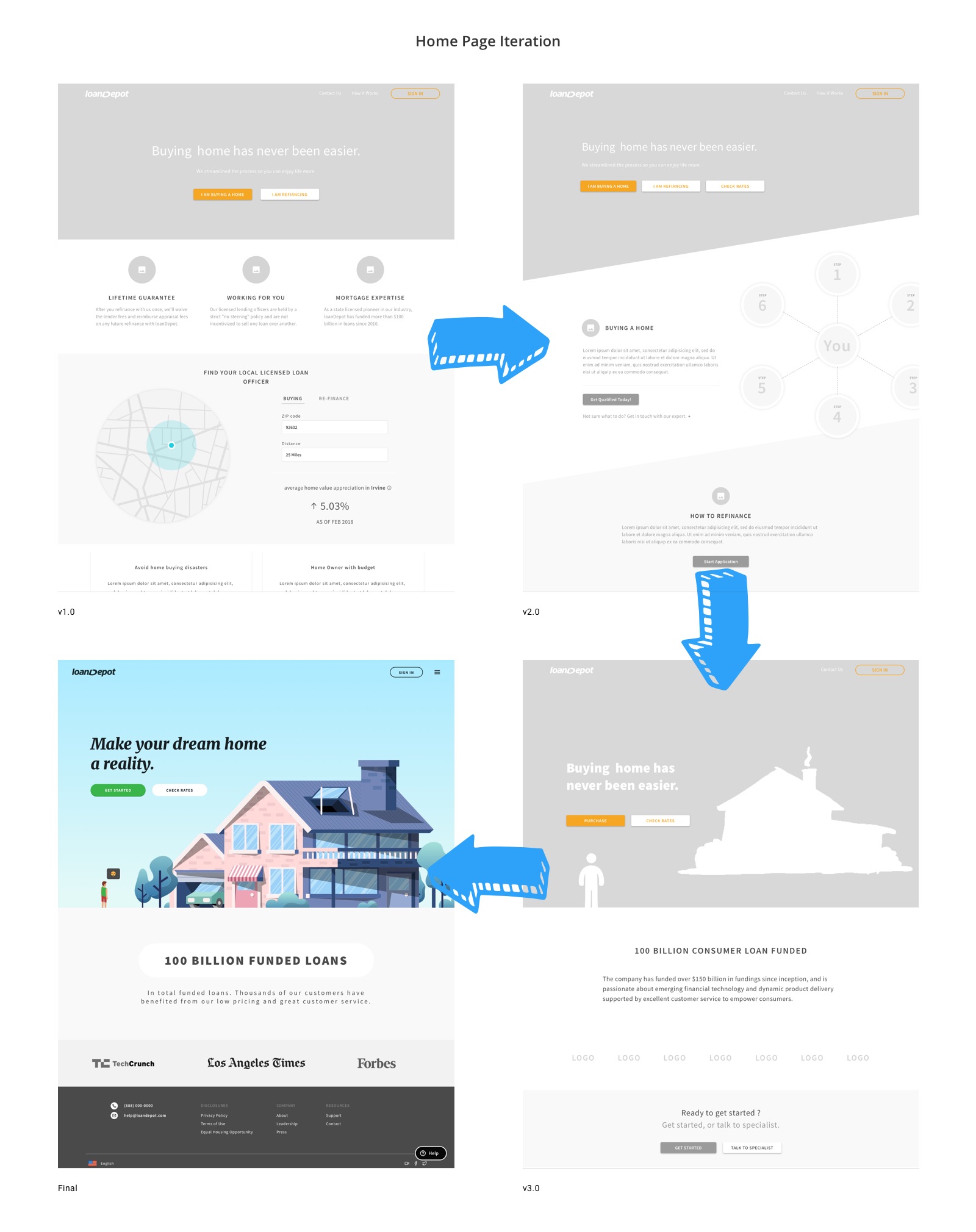
v1 – 6 fields.
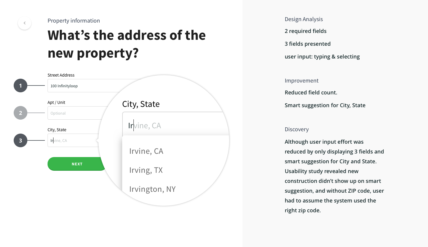
v2.0 – reduced to 3 fields, merged City, State field with smart suggestion.
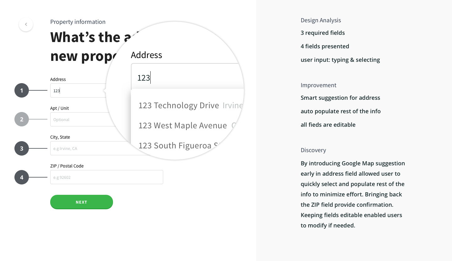
Final design – 4 fields with Google address suggestion.
Details that matter
A large portion of our customers were Latin American and Asian American, many of whom use multiple family names or list their family name before their personal name. To better reflect this diversity, I replaced separate first and last name fields with a single full name input, making the experience more culturally inclusive and reducing user confusion.
Examples:
Chinese name: 王大同 → “王” is the family name (last name), placed before the personal name “大同.”
Spanish name: José Luis Rodríguez Zapatero → “Rodríguez” and “Zapatero” are both family names.
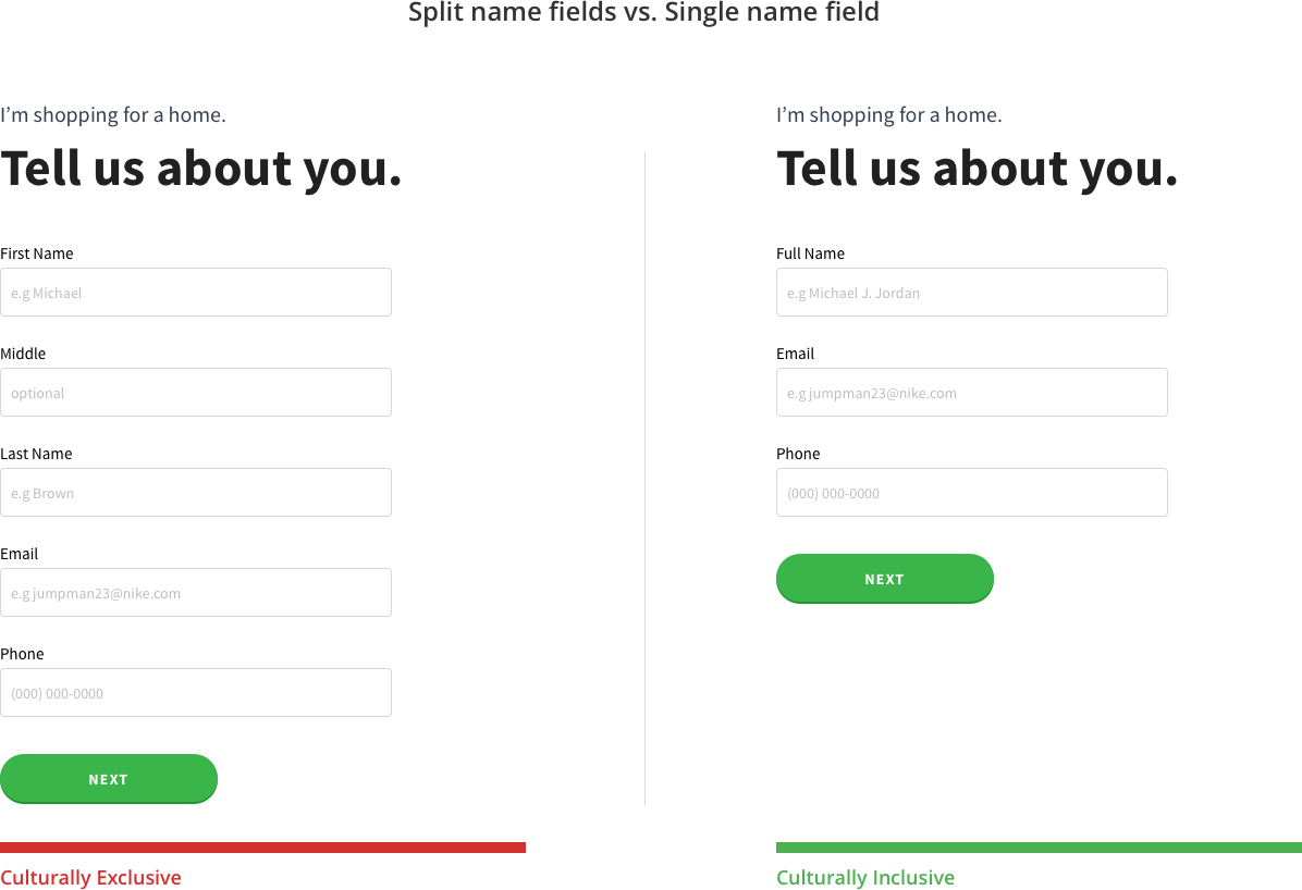
Inclusive for cultural diversity
Addition by subtraction
Less is more. During the redesign, we noticed that every stakeholder meeting added “just one more thing” to the page, such as extra buttons, product explanations, and CTAs. While the intent was to help users understand our offerings, the result was confusion and visual overload.
At one point, a team proposed listing all loan products as separate CTAs, each with its own descriptive paragraph. The homepage quickly became crowded and hard to navigate.
The solution: remove the noise. Focus on one or two clear actions and guide users with purposeful, timely information.
It’s almost 2019, let’s remove stuff.
"It takes just one committed person to kick off the process and change the way your organization builds software."
What UX for MVP was.
What UX for MVP should be.
Creating a shared language
With passion and commitment, I built loanDepot’s first design system inspired by Material Design. I guided the team through each foundational step to create a scalable, unified framework:
1. Created a comprehensive UI inventory
2. Secured organizational buy-in
3. Defined design philosophy, rules, and principles
4. Built a cohesive color palette
5. Established typographic scales
6. Implemented an icon and illustration library
7. Developed the first reusable design patterns
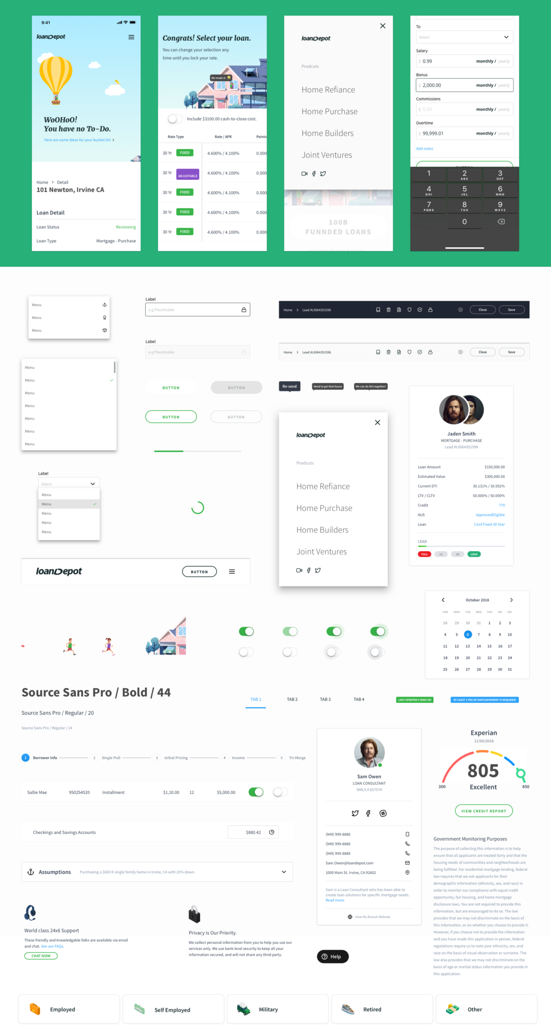
Theme UI.
mobile – mortgage page
mobile – question
mobile – dashboard
mobile – UI controls
mobile – save point
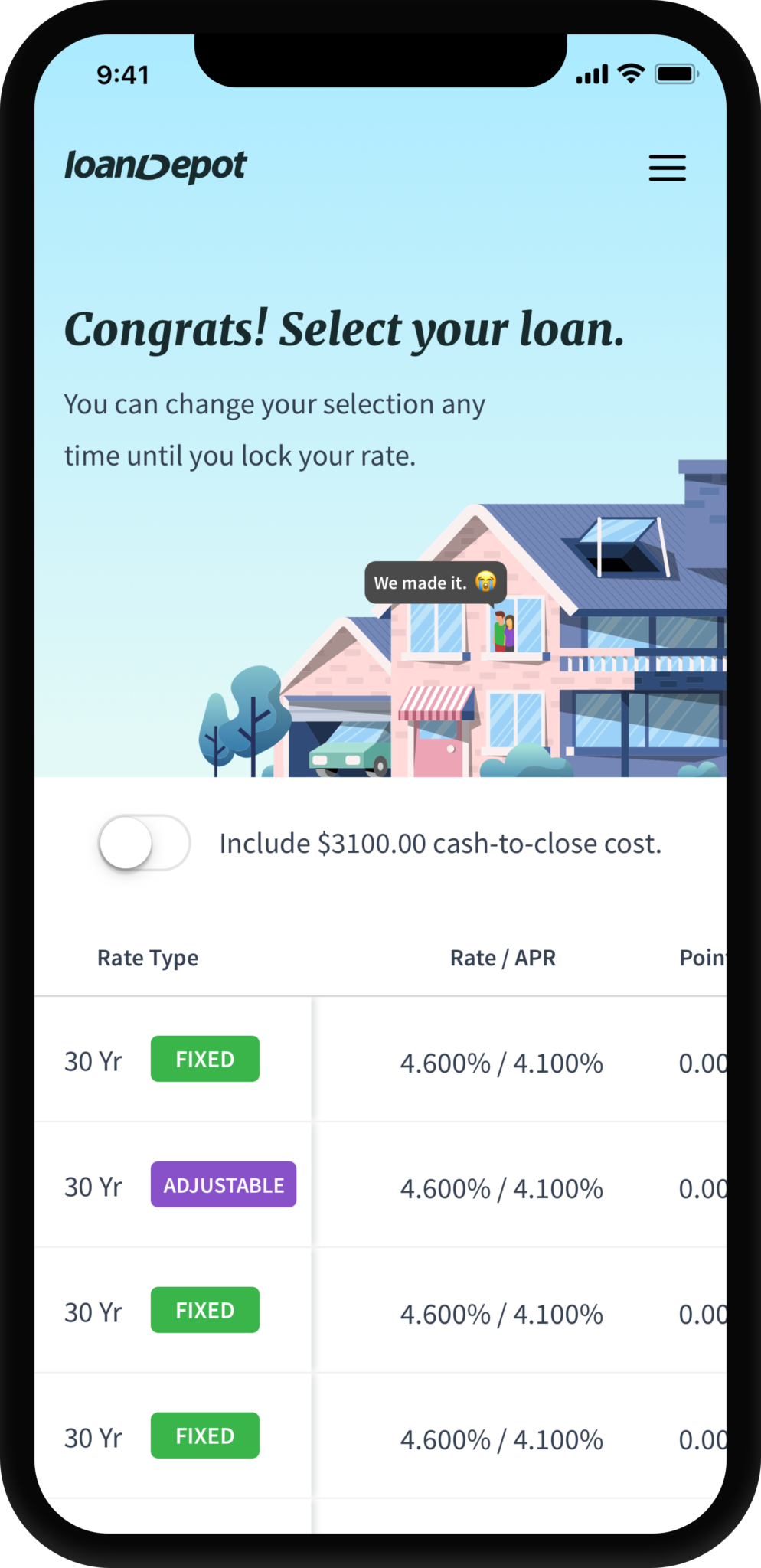
mobile – offers
Design beyond pixels
Creating a design system within a growing fintech company taught me valuable lessons about influence, collaboration, and long-term thinking:
1. Lead with data, not opinions. Designers gain credibility and impact when decisions are backed by measurable insights rather than intuition alone.
2. Involve decision-makers early. Engaging key stakeholders through Lean UX and design sprints fosters alignment and reduces costly course corrections.
3. Treat the system as living. A design system evolves continuously as products, users, and business goals change.
4. Design for users, not hierarchy. The best design outcomes come from serving user needs first. Good design always pays off.
"...It’s not just what it looks like and feels like. Design is how it works."
– By someone who made a ding in the universe.
The journey is the reward
I spent countless weekends and early mornings jumpstarting the design system when few believed in its value. Knowing that my work could positively impact thousands of homebuyers and their families made every hour worth it.
Like the design system itself, being a product designer is a living, evolving pursuit. I’ll continue to stay curious, keep learning, and push to make a meaningful difference.
Final Designs

View on iPad Pro.