Click, Apply, Smile
The $150B Mortgage Experience Redesign
Pre-2016: Mortgage applications were cumbersome. Completing them on smartphones wasn't possible. I led loanDepot's mortgage application redesign for the nation's #2 nonbank lender.
I was part of an ambitious project to redesign the mortgage application experience for loanDepot, the second-largest nonbank consumer lender in the U.S.
Confidential information in this case study has been omitted and obfuscated in compliance with the non-disclosure agreement. The information on this website is my own and does not necessarily reflect the views of my employer/client.
About loanDepot
Since launching in 2010, loanDepot has funded over 150 billion in consumer lending and is now the nation's fifth-largest retail mortgage originator and the second-largest nonbank consumer lender. The company operates 150+ local loan locations nationwide, employs 6,400 team members across the country, including 2,000+ licensed loan officers who hold more than 10,000 licenses.
“Many customers will give you one try and then give up when the design is too difficult or doesn’t satisfy their needs.”
The challenge
UX DEBT
The web application released in 2016 failed to provide a frictionless self-serving experience and struggled to scale for users on mobile devices. Both automated identity & assets verification performed poorly and contributed to a meager website conversion rate.
User annoyances were ubiquitous to a point it was disruptive and led to a distrust of the brand. Customer Support received numerous complaints about customers being stuck in the applying process, highly frustrated, and thus requested incomplete applications along with all sensitive info to be purged.
My priority for the redesign was to enable qualified users to compare and lock rates as quickly and as fun as possible. The desirable outcome was clear: apply, provide info, and lock & roll.
I aimed to simplify the tedious and frustrating process into a delightful journey and hoped to expand our audience base to younger homebuyers.
My goals for the redesign were:
1. Easy and fun to complete the application.
2. Empathize with applicants to be entrusted.
3. Display only purposeful and easily digestible info.
Early proto – Photo capturing with Mitek web SDK.
My role
I led the online application experience design and collaborated with industry experts and PMs on increasing the loan application submission rate. We looked into partnering with 3rd party companies such as Mitek and Finicity to fully automate the application process and reduce the cost-per loan.
During that time, I took the initiative to establish the first company-wide design system to document modularized components and instituted UI / UX principles based on Material Design guidelines.
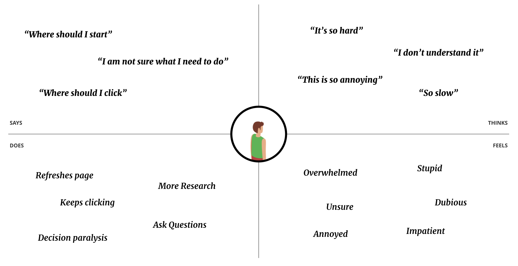
Empathy Map.
Design philosophy
Gamification was the core of my design philosophy. I wanted to introduce fun moments throughout the process by using appealing illustrations, micro-interaction & animation, and they all played a crucial part in improving emotional engagement and aesthetic satisfaction.
This design approach was new and required close collaboration with our marketing department for cohesive branding.

Progress indicator – sole borrower.

Progress indicator – with co-applicant.
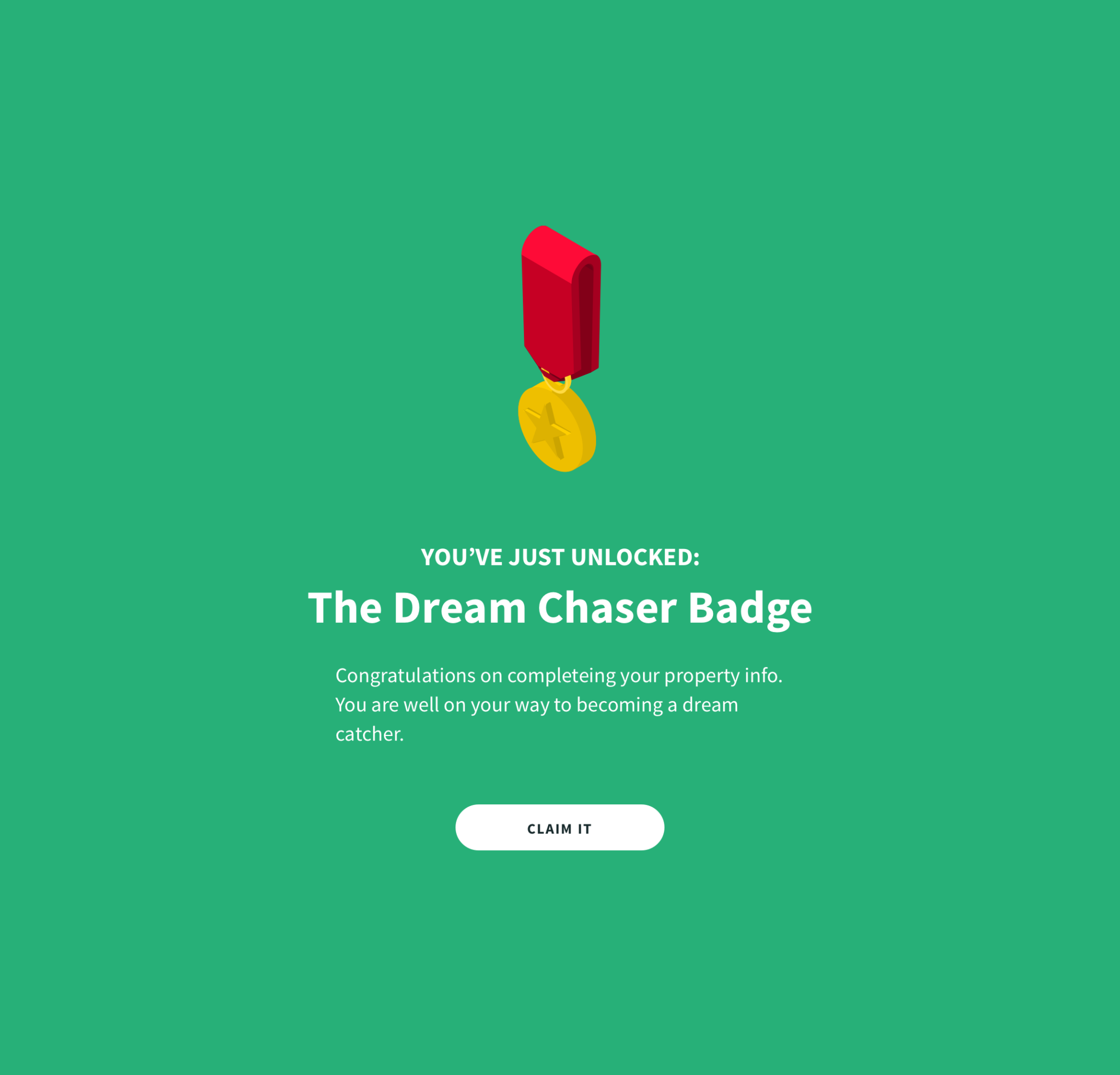
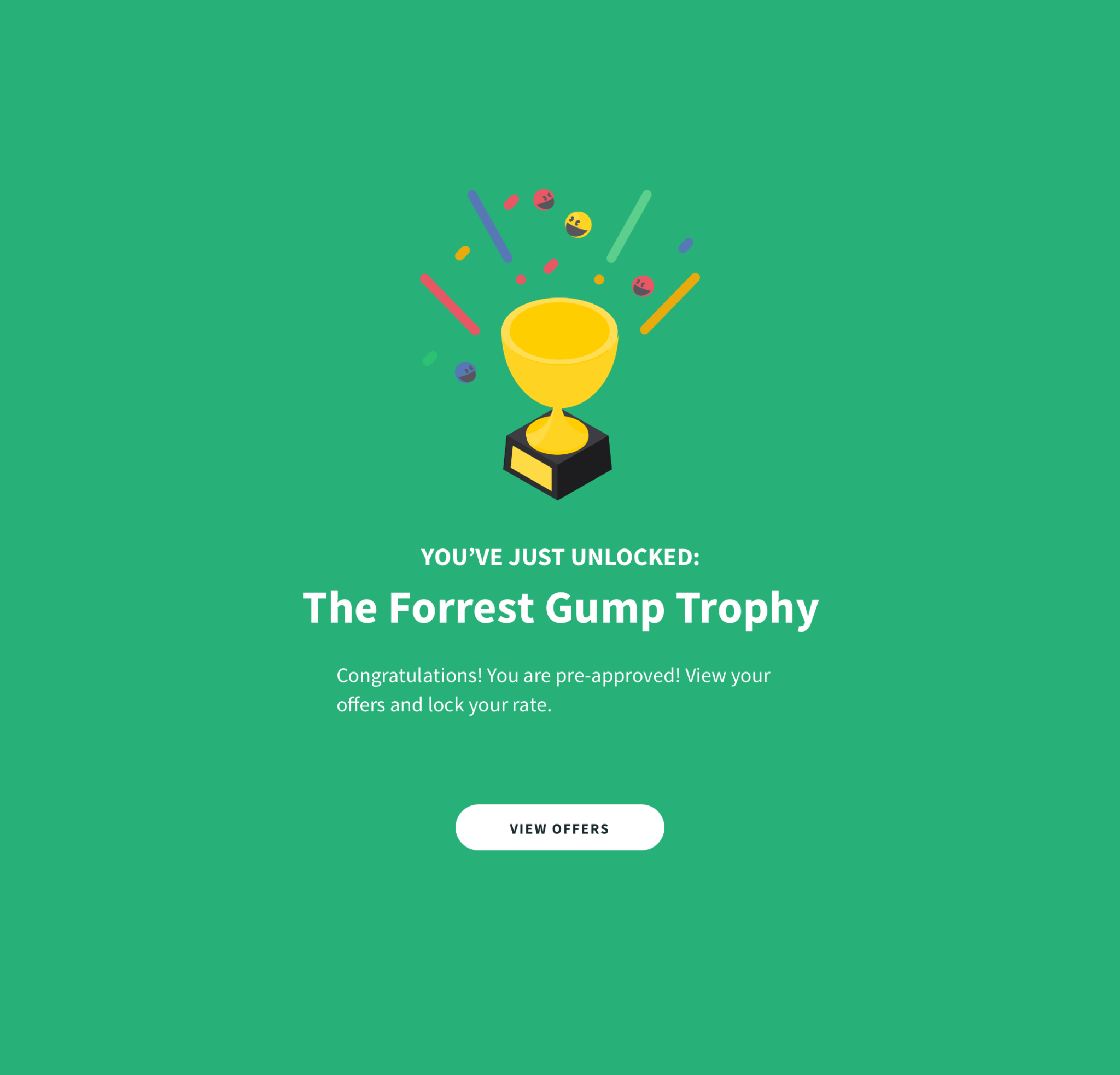
Save points.
From insight to design
I learned from a mentor to start a project by approaching a Business Model Canvas to better align business goals across multidisciplinary teams and solve user problems.
I partnered with our Mixpanel guru to investigate user flow, identified pain points, and measured success in a quantifiable way.
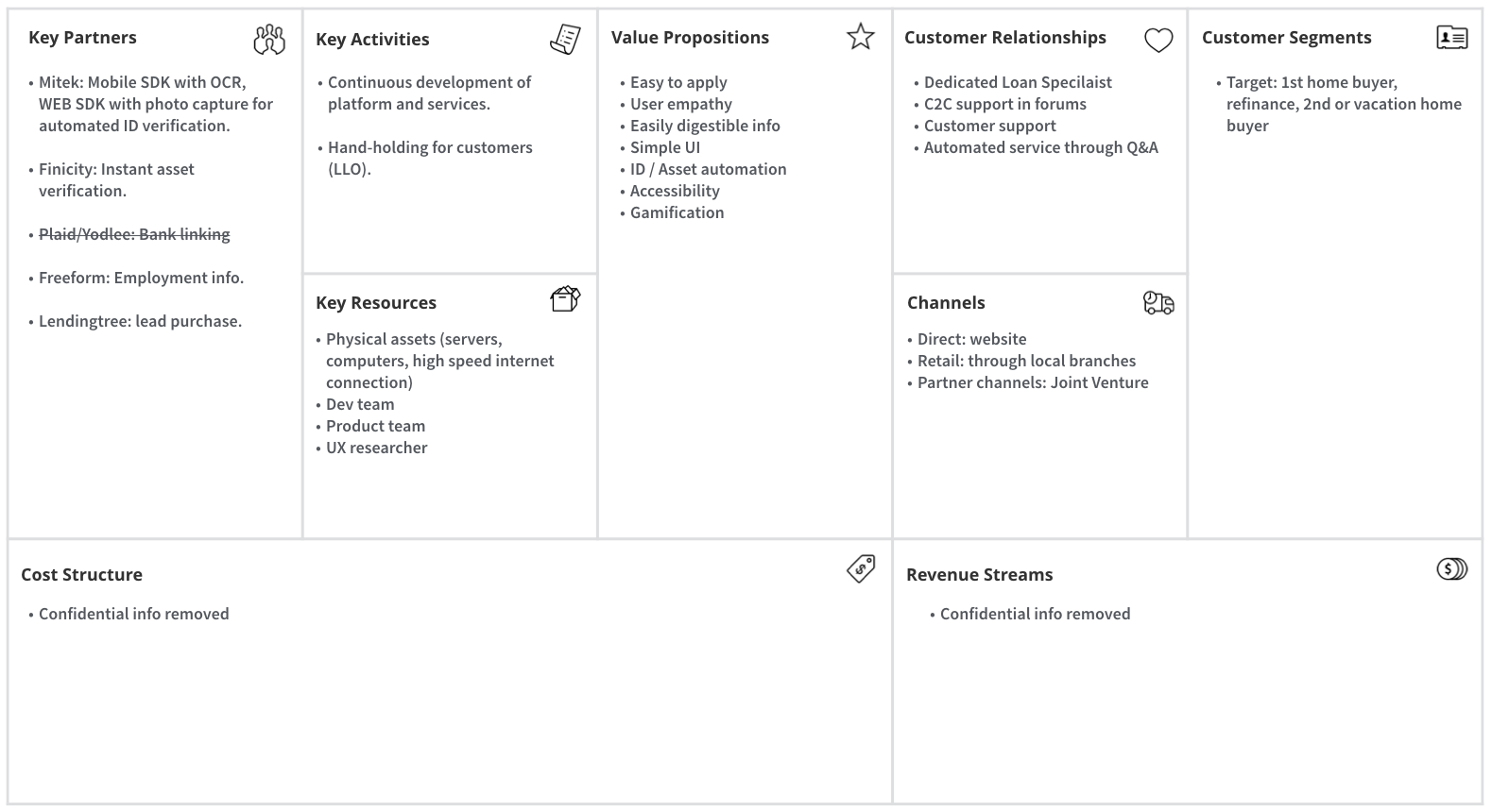
Business model canvas.
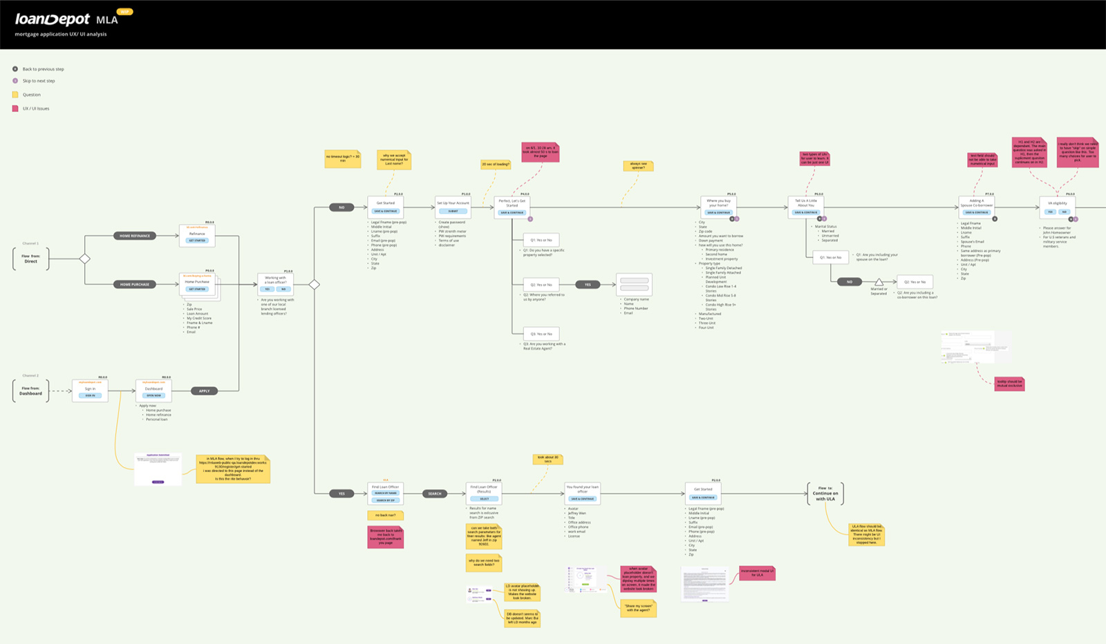
Info Architecture – UX Analysis.
Understanding the pitfalls
Users' feedback reported that they were overwhelmed by company colors (green & purple) on our website. The background video was not optimized for streaming, and there was no obvious cue on how to get started.
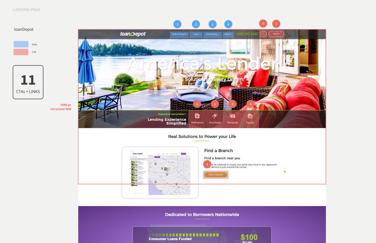
How do I get started?
Users needed a longer time to study the differences between all the options presented to them. They were confused by all the Call-To-Action buttons and links displayed, which led to decision paralysis.
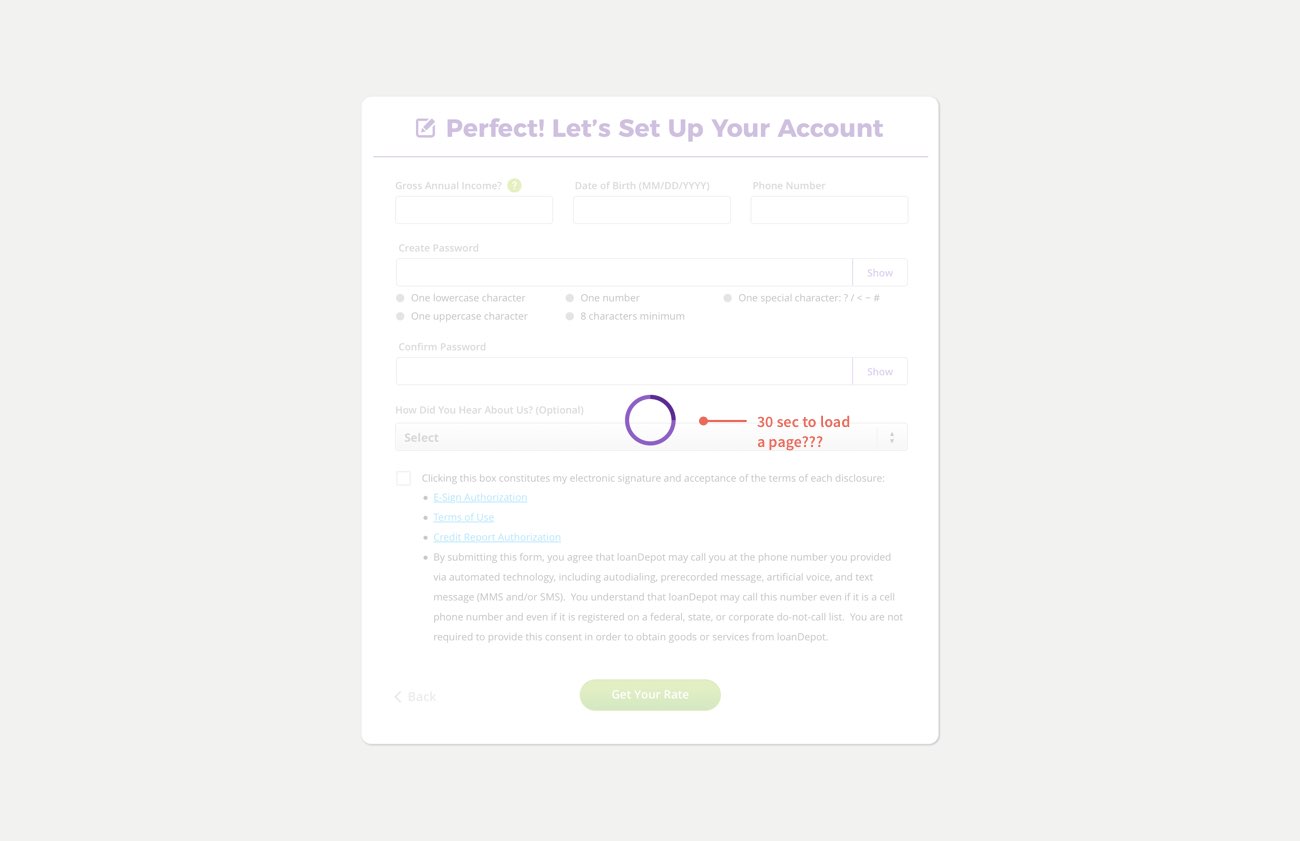
Spinning....Spinning...Spinning
The users were annoyed and refreshed the page when the pages took too long to be loaded. There were cases that a simple page transition takes up to 33 seconds. Poor website performance contributed to a high drop rate.
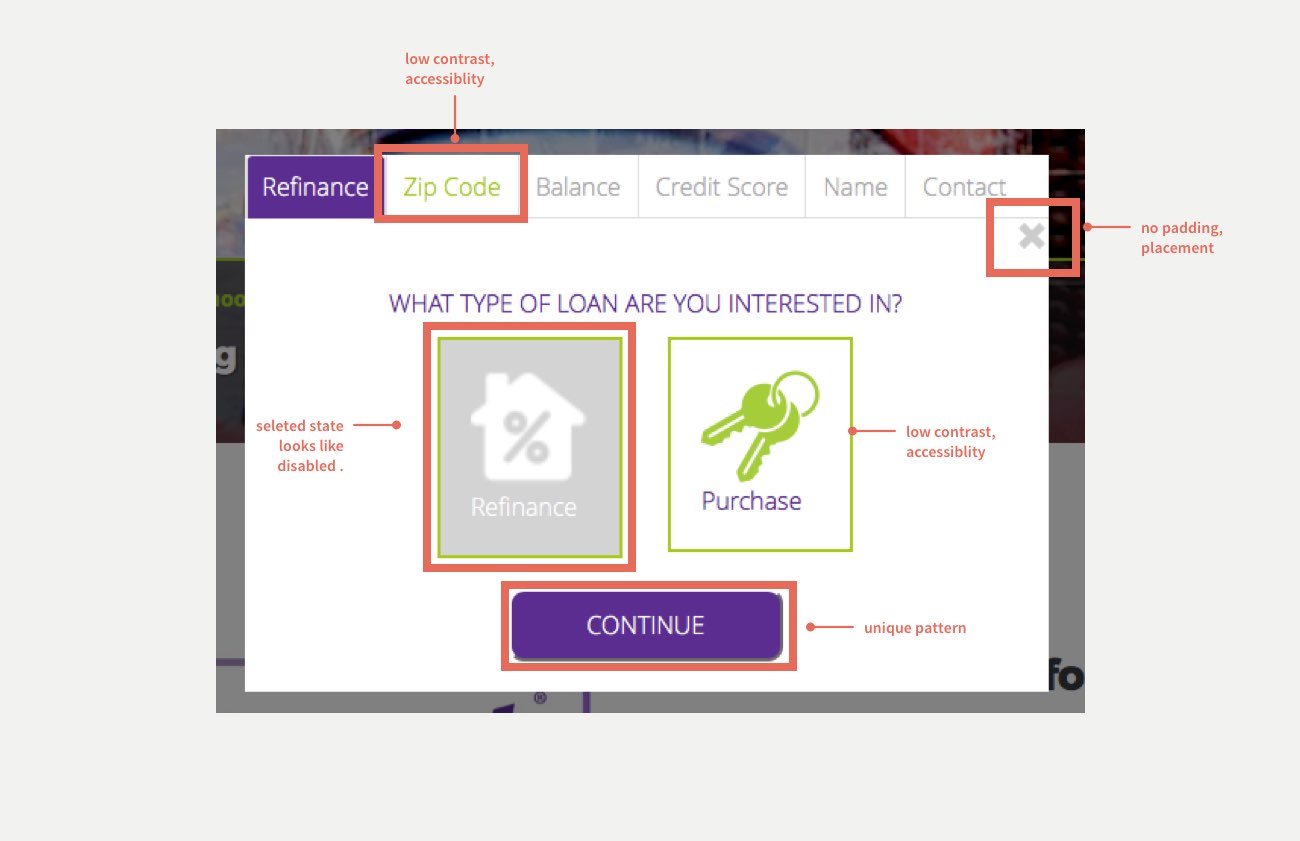
Accessibility & Aesthetic Failure
We scored low on accessibility and contrast tests with everything in branding colors. Users expected the Interface to be intuitive, easy to read to help them move forward quickly.
When the industry slows down, we move faster
Initially, the project started with optimizing usability in mind with dedicated resources and commitment. However, the mortgage industry has its ups and downs, so when the interest rate continues to soar, potential home buyers pause on home purchasing and hit our business hard. With a smaller team and reduced resources, my priority evolved into optimizing user experience and establishing an efficient & effective way to minimize development efforts and ultimately lower cost-per-loan.
Voluntarily, I dedicated numerous weekends to kick start the design system project with a clearly defined design philosophy, deliverable artifacts to supply to the dev team, and get everyone excited.
Refused to normalize the deviants
In the process of redesigning, I initially got pushbacks from PMs, developers, and engineer leads because we already had variations of the component hardcoded for a particular platform.
A unified design system requires resources & commitment. Fortunately, after Product, Dev, Architects all got into a room and discussed passionately 🙂 we came to one rational conclusion - a design system.
Benefits of design system included:
1. Bring newcomers up to speed efficiently.
2. Eliminate knowledge silos.
3. Cost Efficient.
4. Enable faster development and consistency.
5. Scalability.
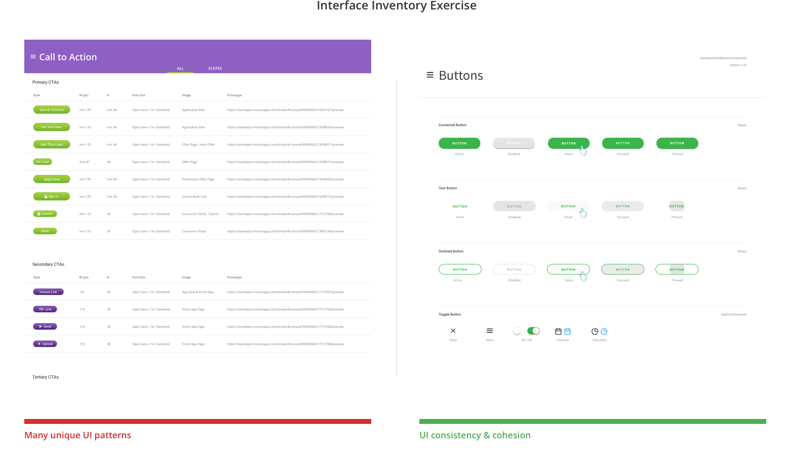
I went thru bunch of different products, captured unique UI pattern for all UI components.
Stay with the problem.
In my early career, I learned a valuable attribute of a good UXer is to stay with the problem. Understanding the motivations, values, and views of a new feature helped me distill needs from wants and develop a pragmatic solution.
For example, when I started the redesign, original I kept the same conventional way of collecting address info with five fields + one picklist for the state.
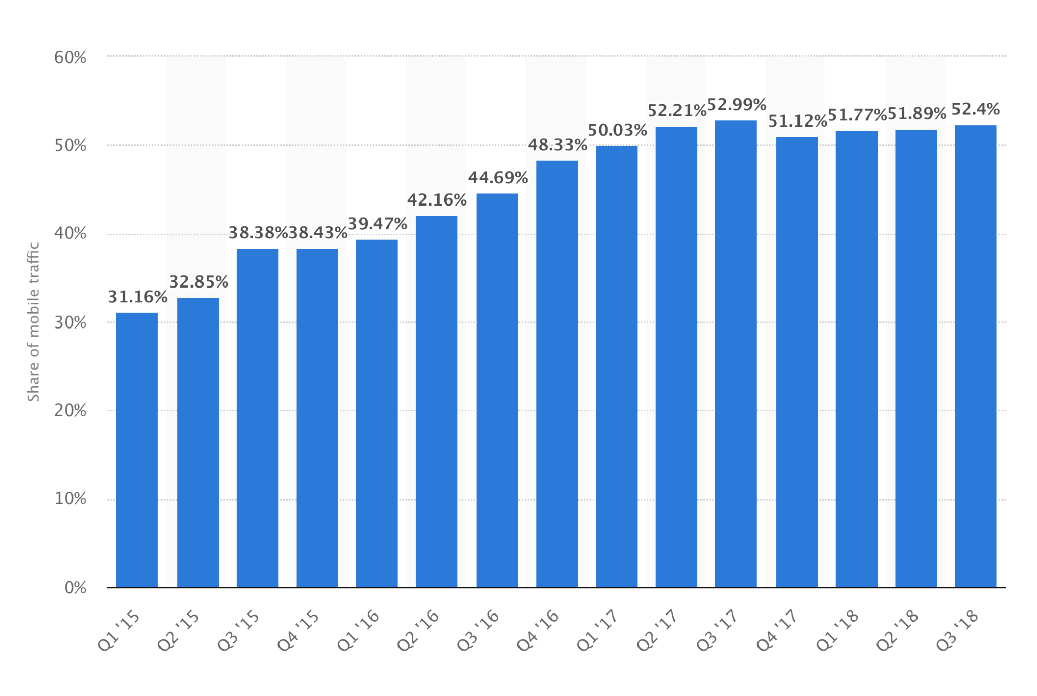
This approach increased the time needed on pages we required the address, and such design introduced user annoyances since picklist required more user input effort on mobile devices. With more than 40% of our applicants started on mobile devices, we faced a huge dropoff rate.
After gaining insights on the pain points of the user journey, I came up with a list of questions.
Q: Why are we asking for addresses?
Q: Why are users struggling with fields?
Q: Why do we want to optimize the experience?
Q: How will our users benefit from the solution?
Q: How will the solution help achieve the project goal?
Q: What are the wants? And needs?
Q: What did users do when faced with annoyances?
Design iteration
Sometimes oversimplified design, although with good intention, will lead to usability issues. The following iteration of our address form shows how usability findings helped me to reach the final design. Obvious always wins.
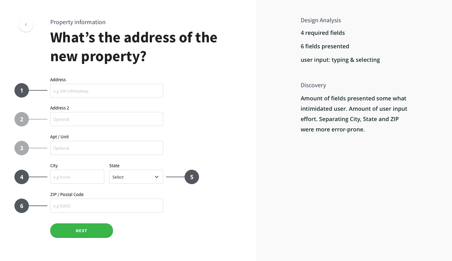
v1 – 6 fields.
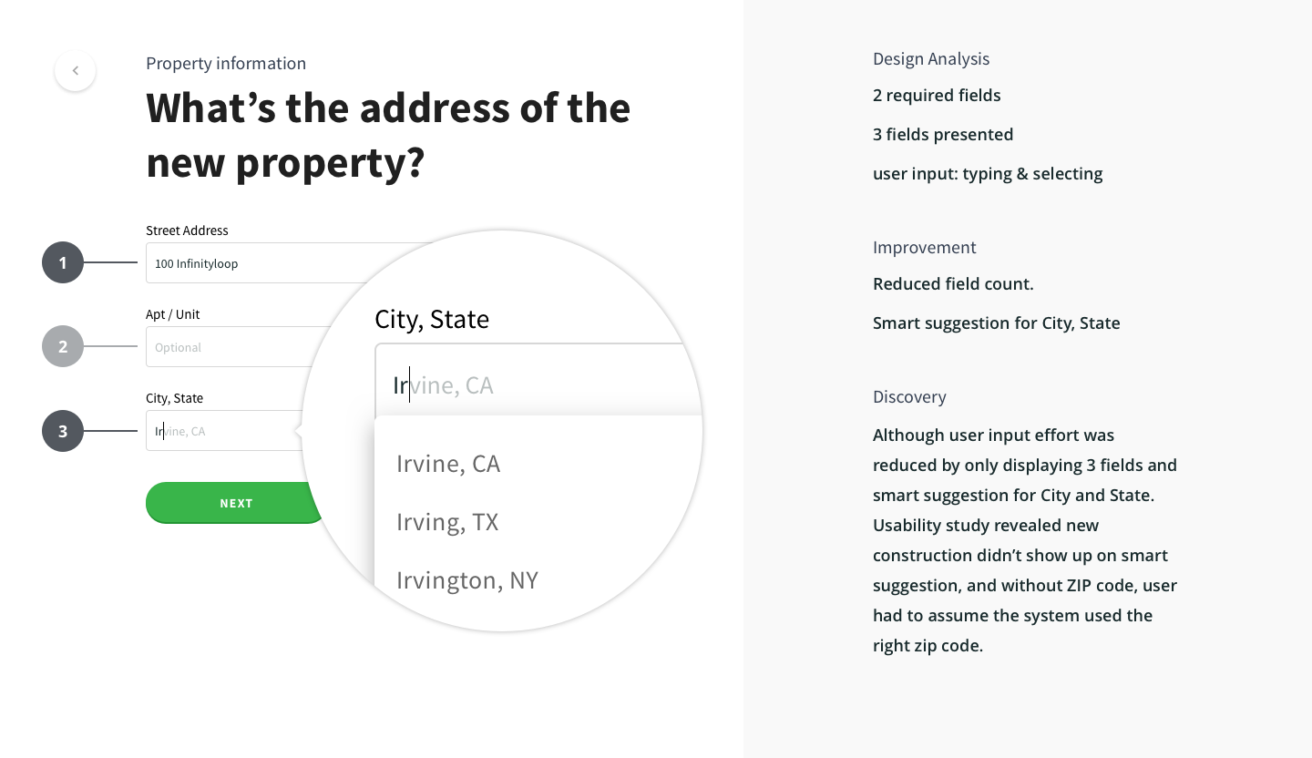
v2.0 – reduced to 3 fields, merged City, State field with smart suggestion.
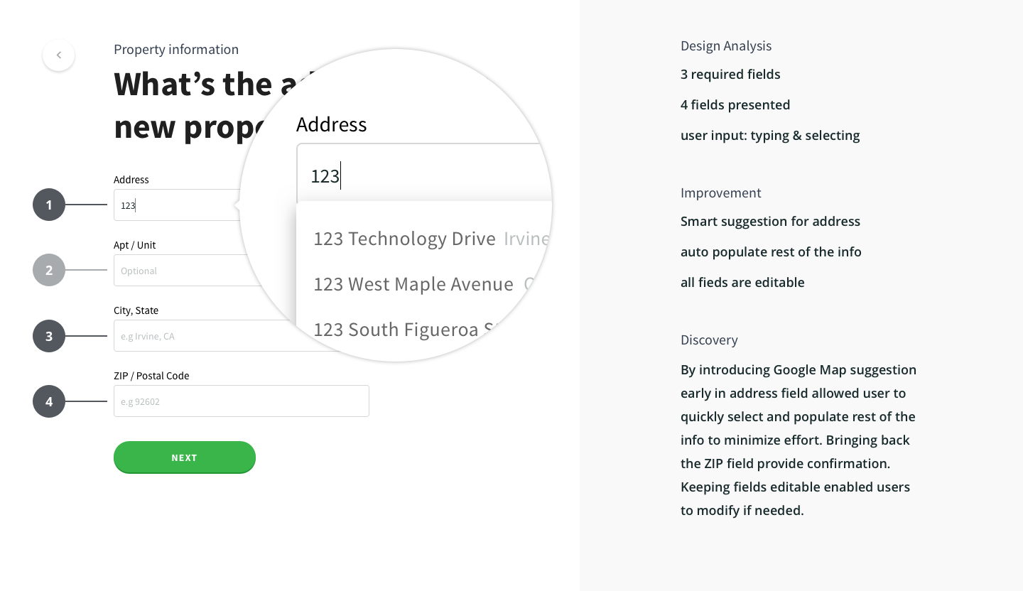
Final design – 4 fields with Google address suggestion.
Small things can make a big impact
BE INCLUSIVE
A significant percentage of our customers are Latin American and Asian Americans, who often have more than one last name from each parent's side or use the family name as first, followed by personal name. A single full-name field approach made it more culturally inclusive and reduced guesswork.
E.g. Chinese name: 王大同.
"王" = Family name (aka Last Name) positioned in front of the personal name.
"大同" = Personal name (aka First Name) positioned at last.
Eg. Spanish name: José Luis Rodríguez Zapatero.
Both "Rodríguez" and "Zapatero" are Family names (aka Last Name).
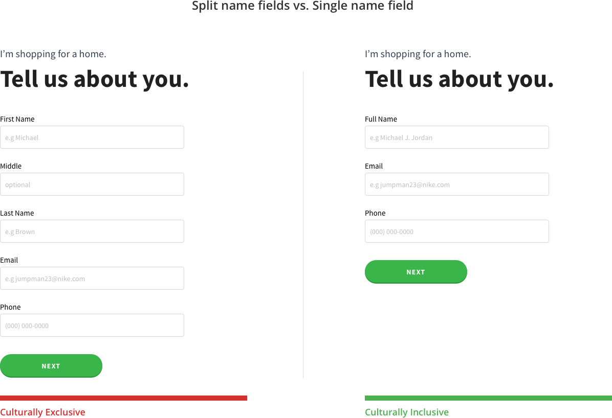
Inclusive for cultural diversity
LEFT TO RIGHT
Studies by Bill Chung revealed that skeleton screens helped create the illusion of short page load times in apps and on the web. Most people perceived a shorter duration of the skeleton loading screen with a left to right wave animation from his usability tests. We have to call out to 3rd party vendors (E.g., Linking Bank for asset verification) on some pages, which often leads to slower feedback time. Loading behavior was redesigned to display skeleton screens with the motion to maximize the wait time experience.
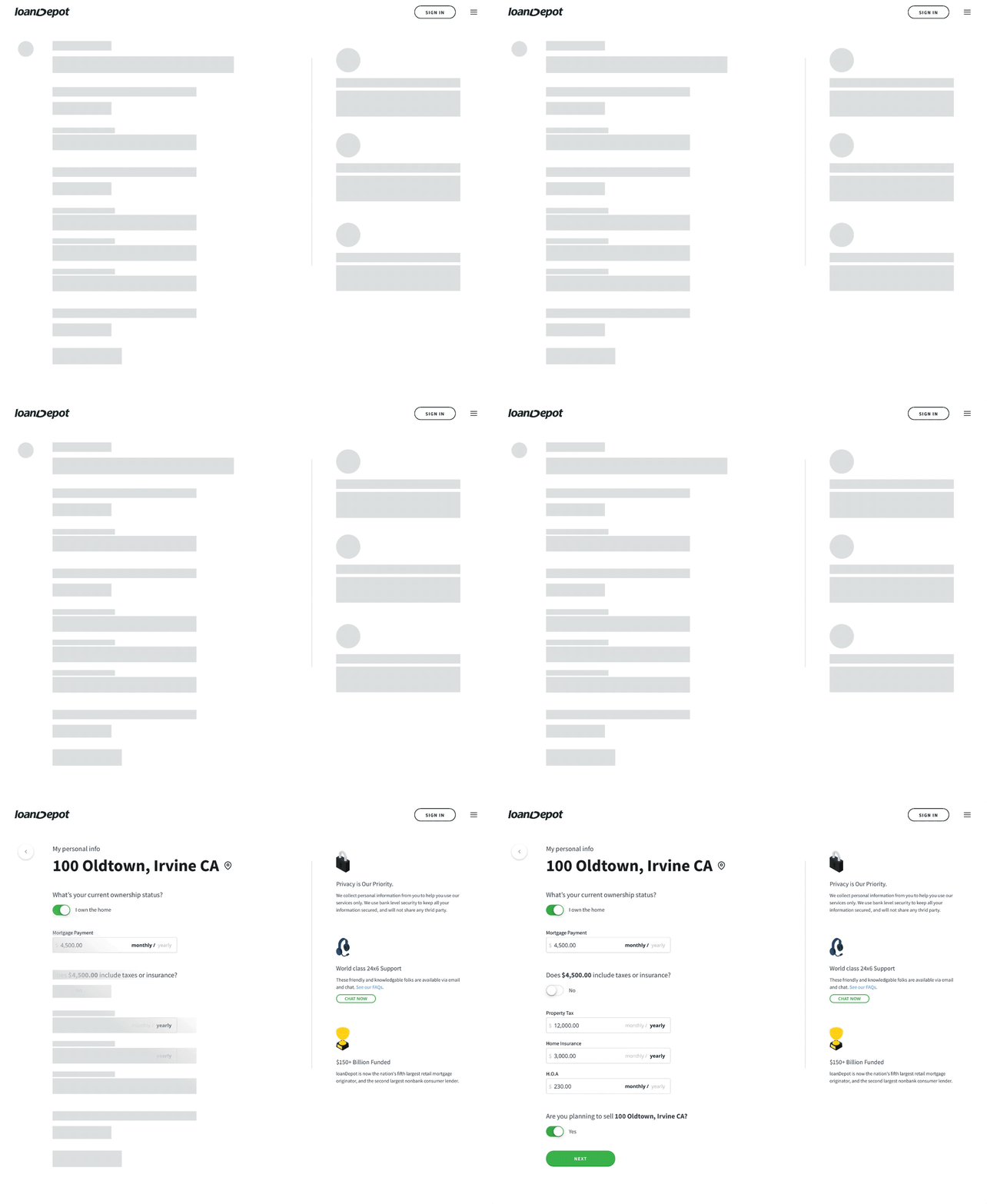
Right to left was perceived as longer loading time.
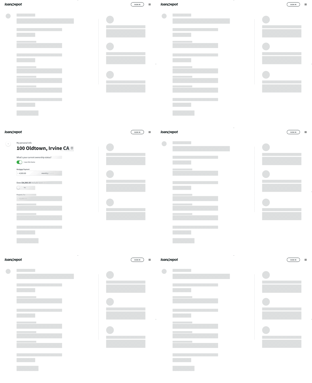
Left to right was perceived as shorter loading time.
Think, make, check, and repeat
I followed the lean UX when approaching a design solution and moved away from mocks into prototypes as quickly as possible to validate ideas. I relied heavily on Invision w/ Craft for rapid prototyping and used ProtoPie to build working prototypes with more sophisticated interaction design and micro-animations. By following the Lean UX cycle, we successfully got people involved early on during the design process. We conducted usability tests with internal staff (Loan Officer, Customer Support, Legal, and Developers) and gathered valuable insights on simplifying the application before testing with users.
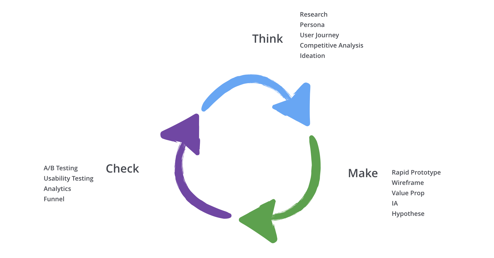
Lean UX cycle.
Design > remove > check
Come on, let's remove stuff, so we don't overwhelm our users with ALL the info we think is important to them (it's not). During the design process, we discovered every time we met with stakeholders (e.g., business owners), the list of things to add to the page kept growing. The thinking behind it was to help users understand our products, but often the approach produced contrary outcomes. For example, one team suggested having all of our loan products displayed in Call-To-Action buttons. Others requested a paragraph near the CTA to explain what each product is...and they kept squeezing stuff onto the home page to make it extremely cluttering. Solution = remove noise. Allow users to focus on one or two simple tasks, and we guide them through with useful info.
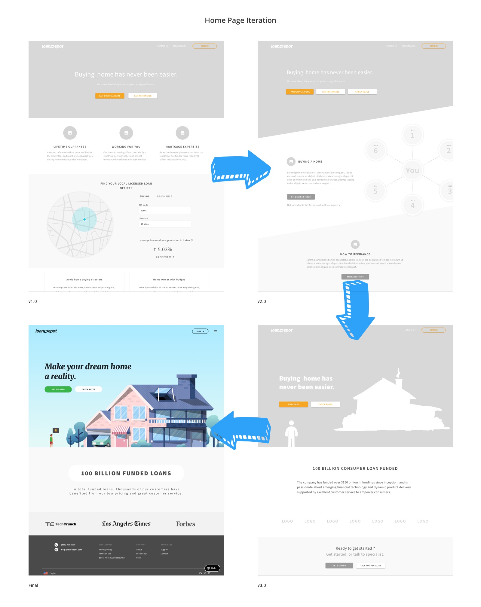
It’s almost 2019, let’s remove stuff.
Be the one that is committed to making a difference
One of the project and personal goals is to set up a design system. The process is painstaking and requires a tremendous amount of perspiration.
I started by working closely with PMs, POs, and Engineer Lead to redefine and realign Minimum Viable Product (MVP).
"It takes just one committed person to kick off the process and change the way your organization builds software."
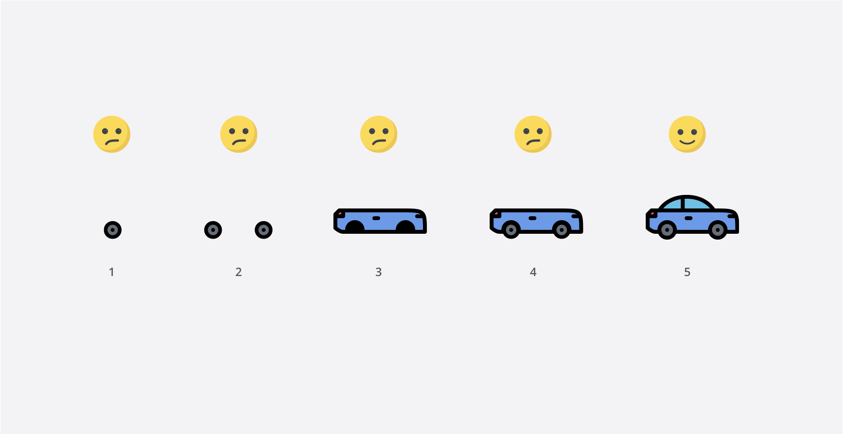
What UX for MVP was.
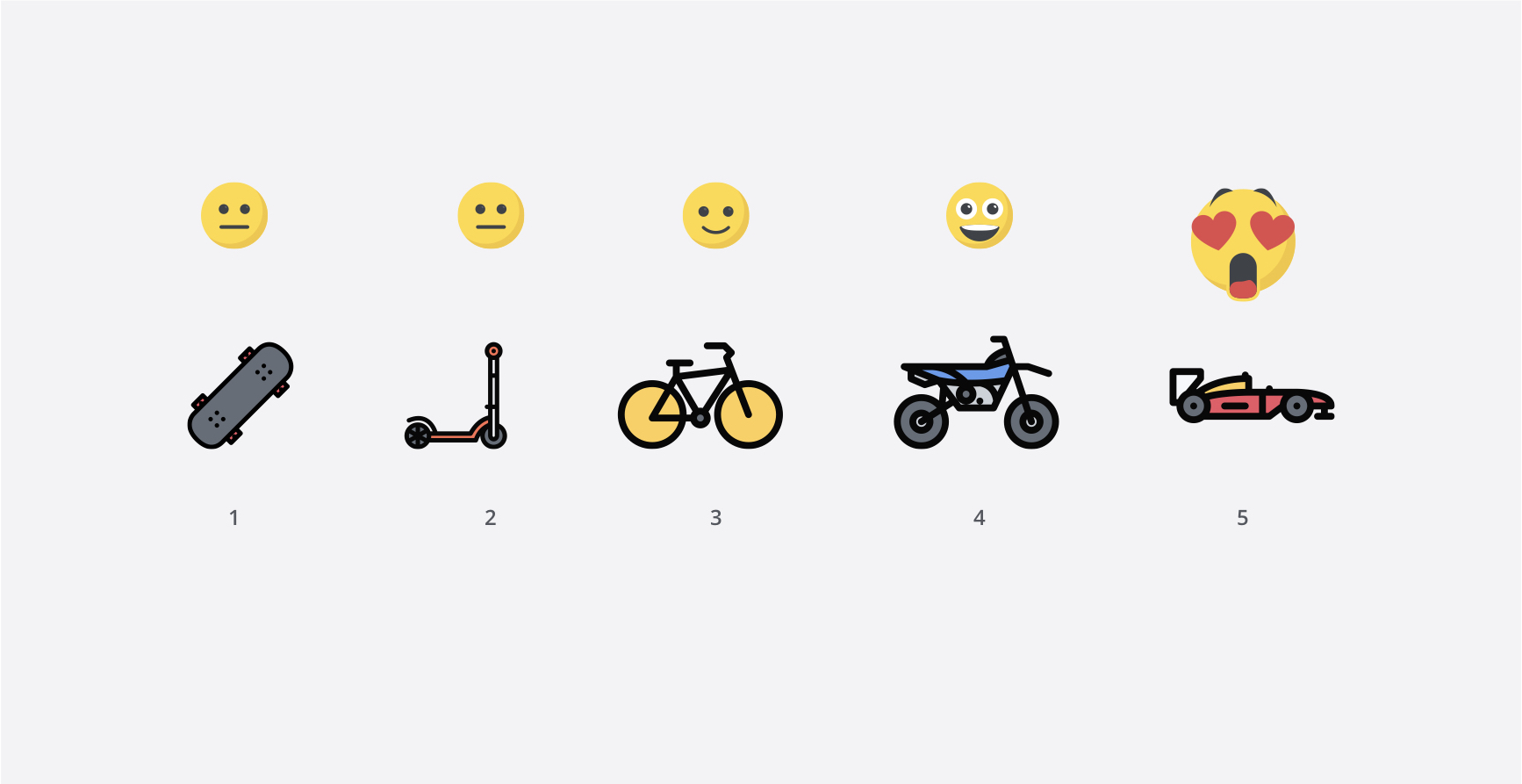
What UX for MVP should be.
Design system
With passion and commitment, I followed Material Design System templates and went thru the following steps to carry the team to what we are today:
1. Created UI inventory
2. Got organizational buy-in
3. Established philosophy, rules, and principles
4. Built color palette
5. Built typographic scales
6. Implemented system and illustration icon library
7. Built first design system pattern
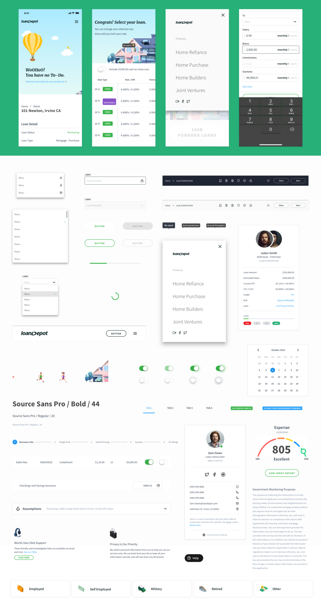
Theme UI.
Mobile 1st is not something nice to have
The % of mobile device website traffic worldwide reported by Statista further supported our findings from Mixpanel. 40%+ of our application traffic started on mobile devices. It was clear that being mobile-friendly was not enough. Mobile 1st was what we needed to optimize usability and reach out to a broader audience. As of December 2017, the average age of our registered users are 50+ yr old and started the loan application via dialing.
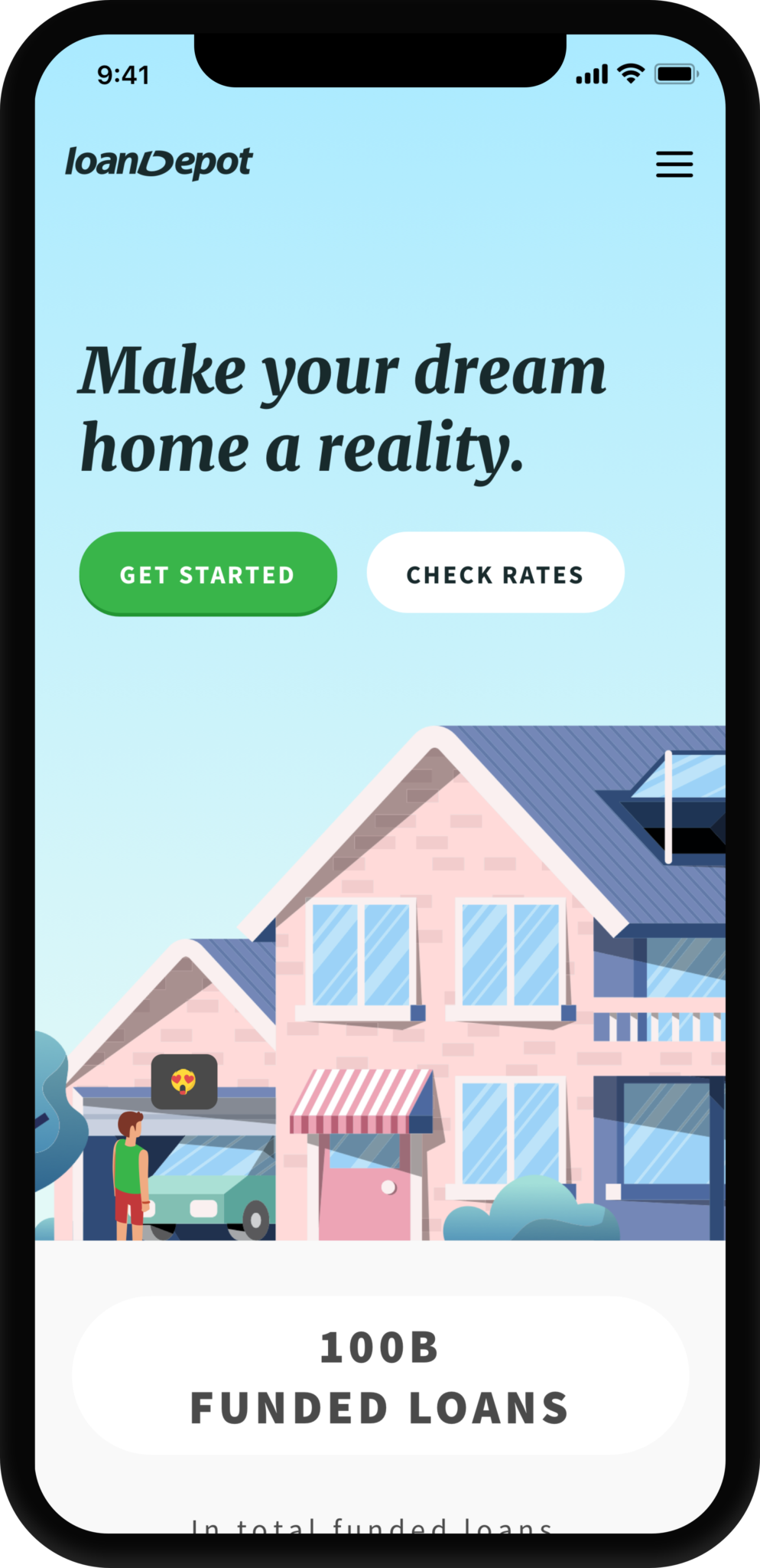
mobile – mortgage page
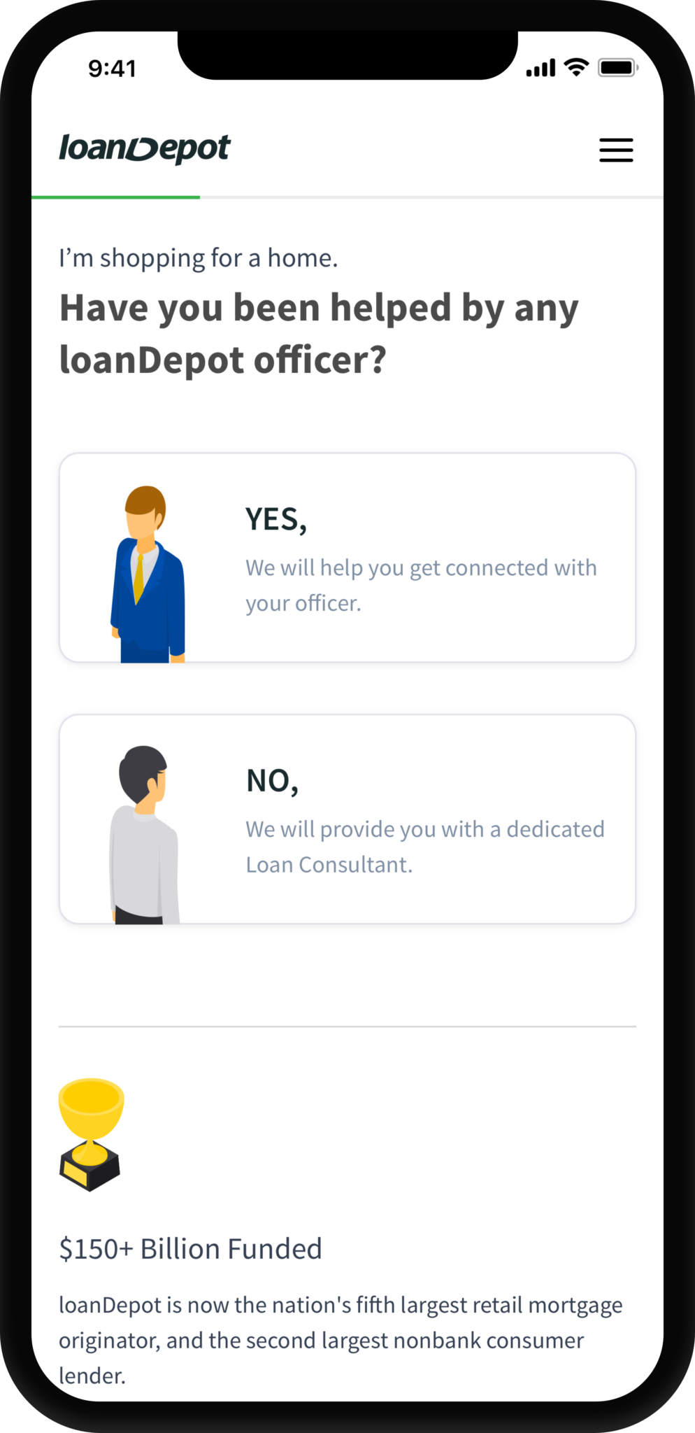
mobile – question
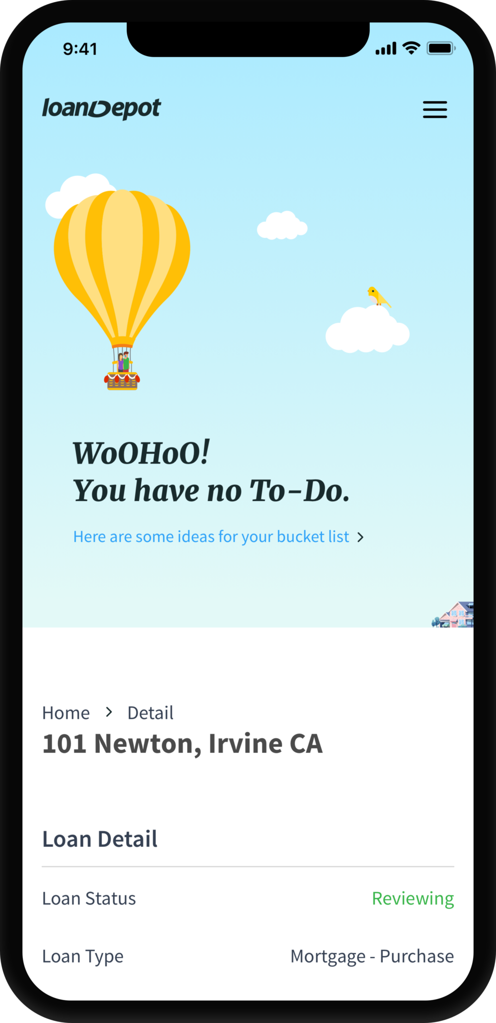
mobile – dashboard
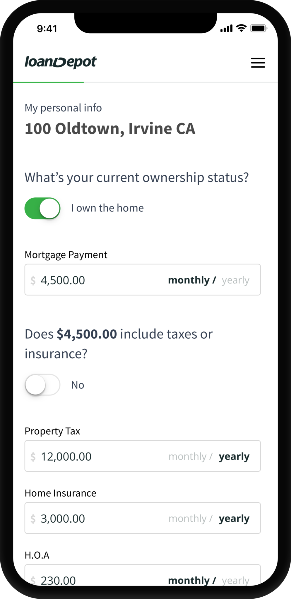
mobile – UI controls
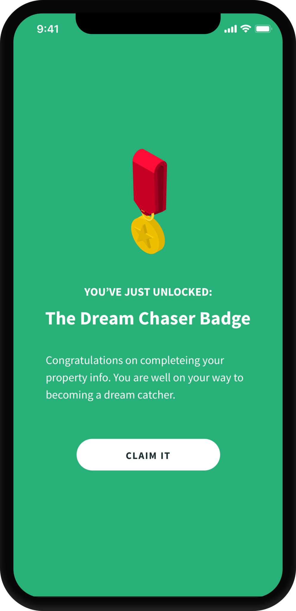
mobile – save point
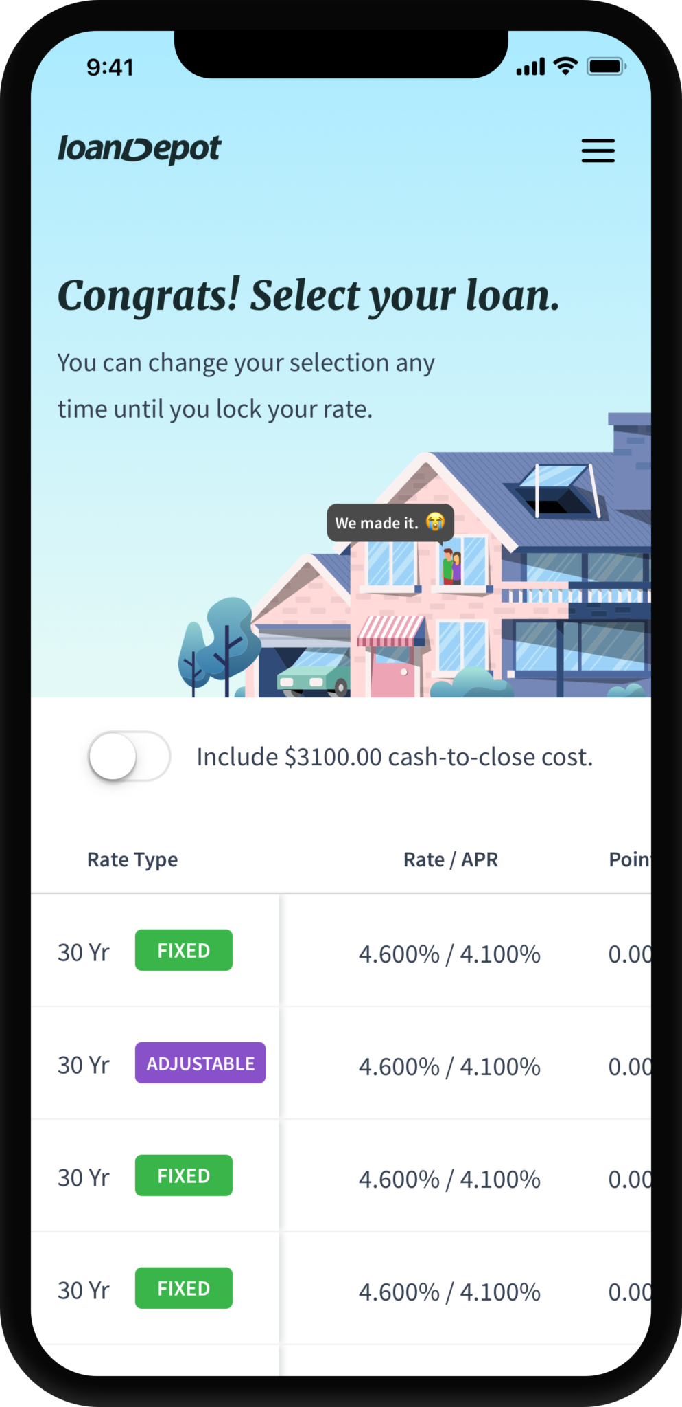
mobile – offers
Design the design process
By taking the initiative to create a design system in a young Fintech had taught me many valuable lessons:
1. Designers can be impactful and welcomed to be part of the business decision-making process when we speak data rather than just feelings.
2. Get key decision people involved early on with the design process (lean UX, Sprint) helped the entire team course-correct and goal alignment.
3. Design system is a living thing, and it will never be complete.
4. Always design for the users, not your boss or boss's boss. Good design will pay off.
"...It’s not just what it looks like and feels like. Design is how it works."
– By someone who made a ding in the universe.
The journey is the reward
I dedicated numerous weekends and was first in the office to kick start the design system when no one else believed in it. When I know what I do will positively impact thousands of home buyers and their families, I feel I am a better person off work.
Like the Design System, being a Product Designer is a living thing; I will continue to be curious and hungry to make a difference.
Designs
View on iPad Pro.

