Accounting App
The interface of the business in your palm
Client's company was going through transformation to focus on providing SMBs (Small and Medium businesses) with user-friendly accounting applications. The following case study demonstrates my involvement and contribution to streamline accounting for SMBs owners on-the-fly.
Confidential information in this case study has been omitted and obfuscated in compliance with non-disclosure agreement. The information on this website is my own and does not necessarily reflect the views of my employer / client.
MY ROLE
I was part of the mobile development team and responsible for the user experience and interaction design of the Android app. I produced all deliverables such as information architecture, UI flow and clickable prototype and presented to the core team between Nov 2015 to Feb 2016.
THE CHALLENGE
From bad gene to bad blood?
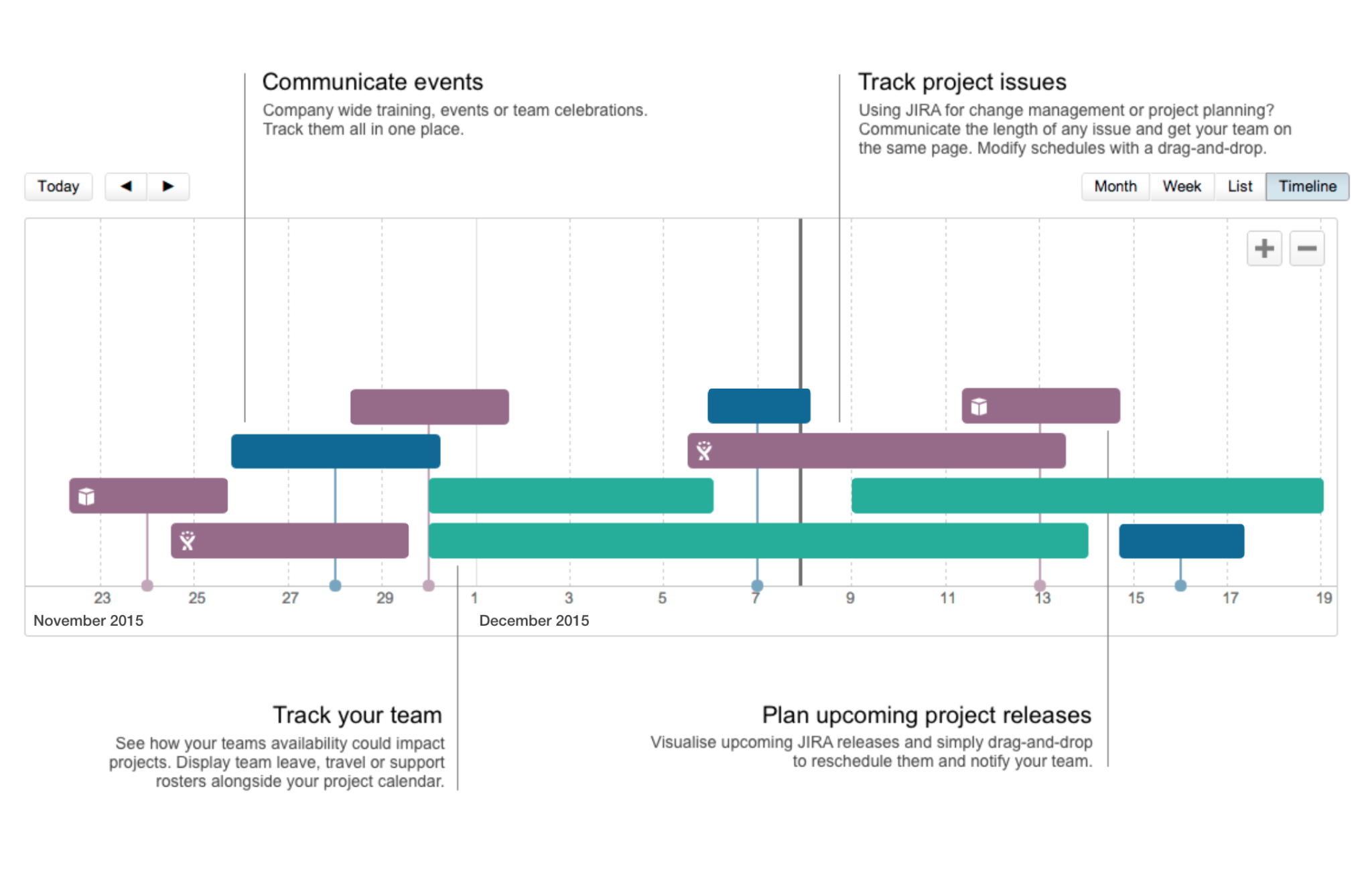
I got involved with the project when the core team discovered critical usability issues with the existing product. My job was to identify pain points and improve the over-all usability of the app, and was also responsible to design a frictionless flow for all key features including newly introduced features - OCR and Bank Reconciliation.
Due to tight deadlines, we were delivering high-fidelity clickable prototypes to dev team for each sprint. The time we needed to reserve for usability test and QA meant I had only 2 weeks to get my heads around the technologies and finalize proof of concept.
THE APPROACH
Let’s make it meaningful
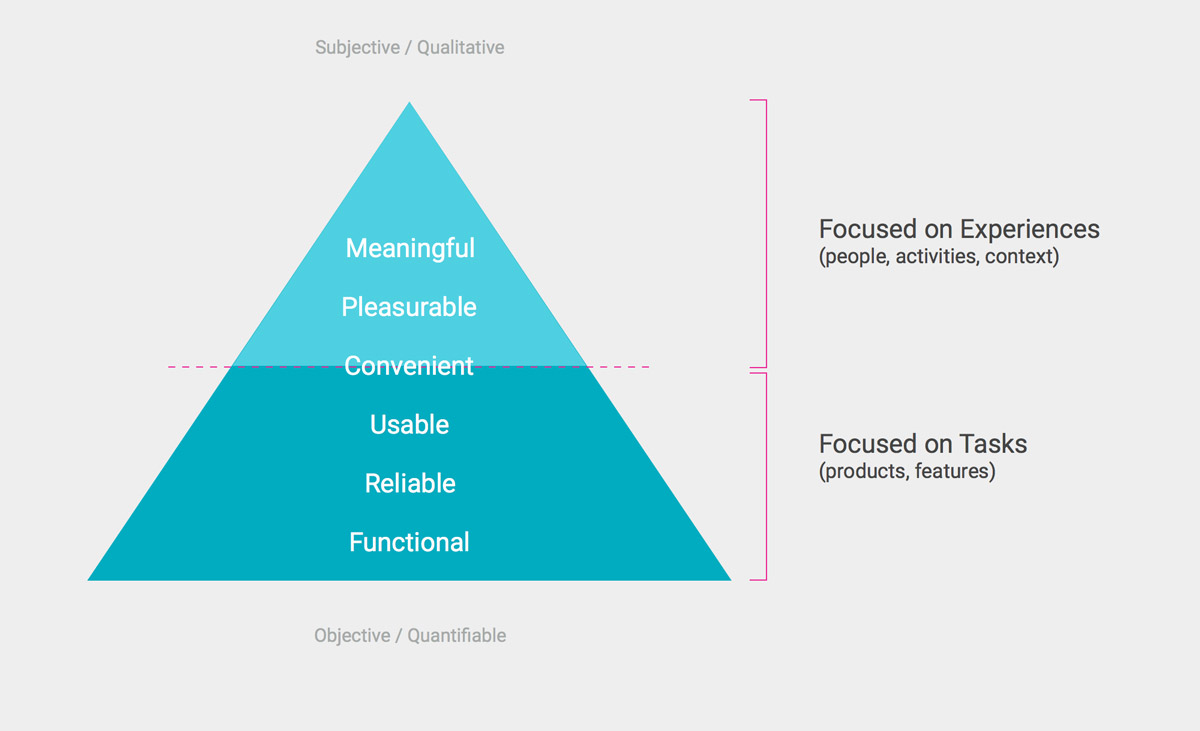
Our objective was to develop user-friendly app that intrigues and empowers users to do accounting on-the-fly. We emphasized on solely displaying useful and meaningful information for our user which enables users to make decisions with easily digestible data.
NATIVE VS RESPONSIVE VS HYBRID?
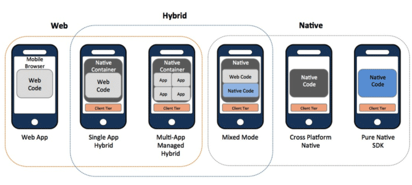
Due to tight deadlines, we utilized some responsive pages from the web app which allowed for code reuse and deployment of builds cross-platform. This was a conscious decision although knowing it would compromise the user experience. Majority of the app was developed natively using Android Studio, however a few pages within the app utilized responsive framework from the web app, making it a a hybrid after all.
Author/Copyright holder: 3Qi Labs Inc. Copyright terms and licence: All rights reserved
BE ON THE SAME PAGE
Learning the requirements and challenges from stakeholders helped us to comprehend and identify potential roadblocks. Together we set the right expectations and constructed a shared vision for the app. I developed customer experience strategy and phase planning for the app.
THE DISCOVERY
What does accounting mean to you?
The discovery phase was an intense effort, a two days back-to-back hothouse that allowed us to define project milestones, audit the existing work, align our vision, and begin research on users’ wants & needs, and pain‐points that caused high abandon rate.
We also involved top level engineers during discovery phase to help us understand technical feasibility, limitations and constraints.
Our studies revealed that there was an overall consensus among users on the expectation of doing accounting on mobile devices, it needs to be efficient. Users were motivated to use the app as their business interface when the app provides useful information for making smarter business decisions and thus help business grow, implying the immense importance of user experience design.
BE IN BIZ OWNERS’ SHOES
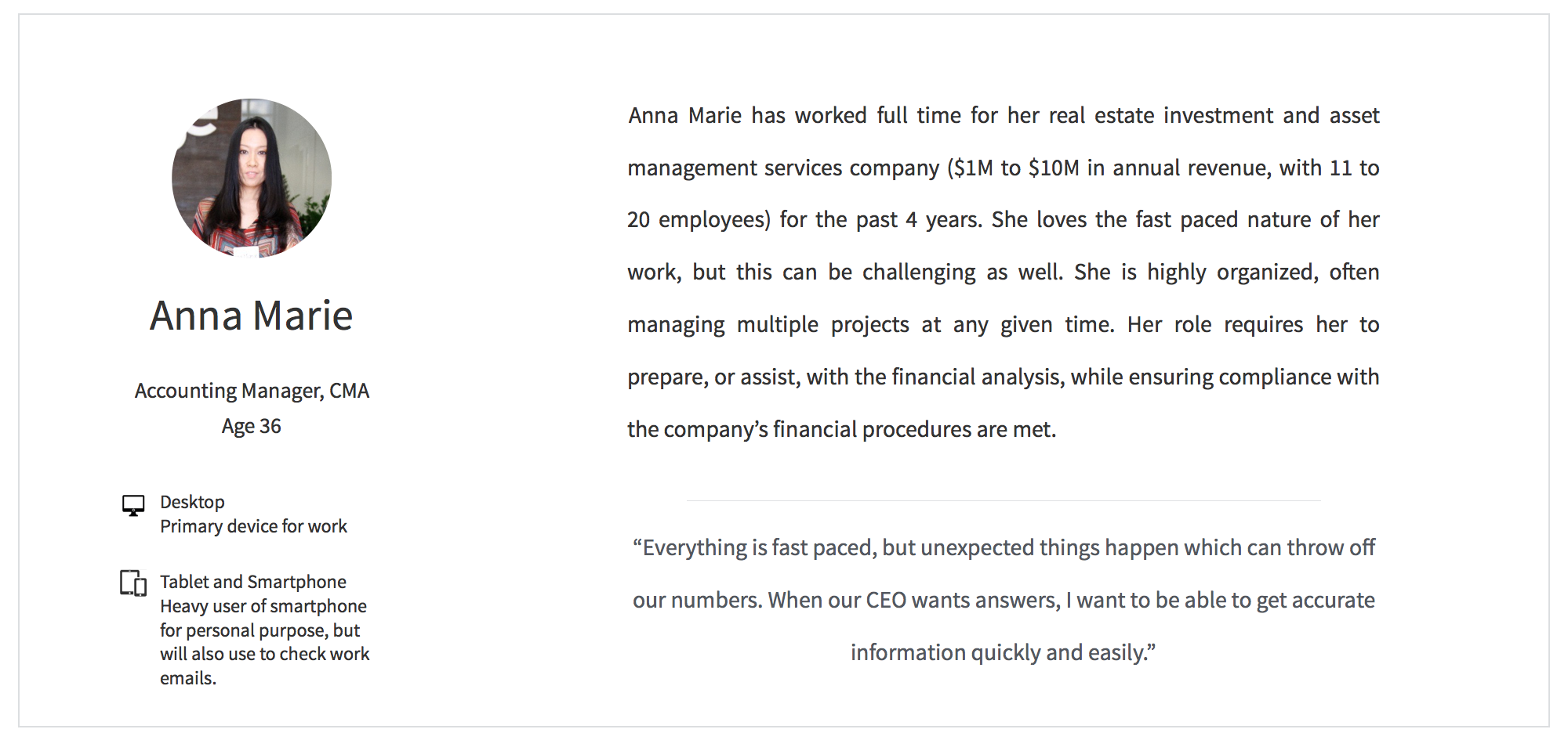
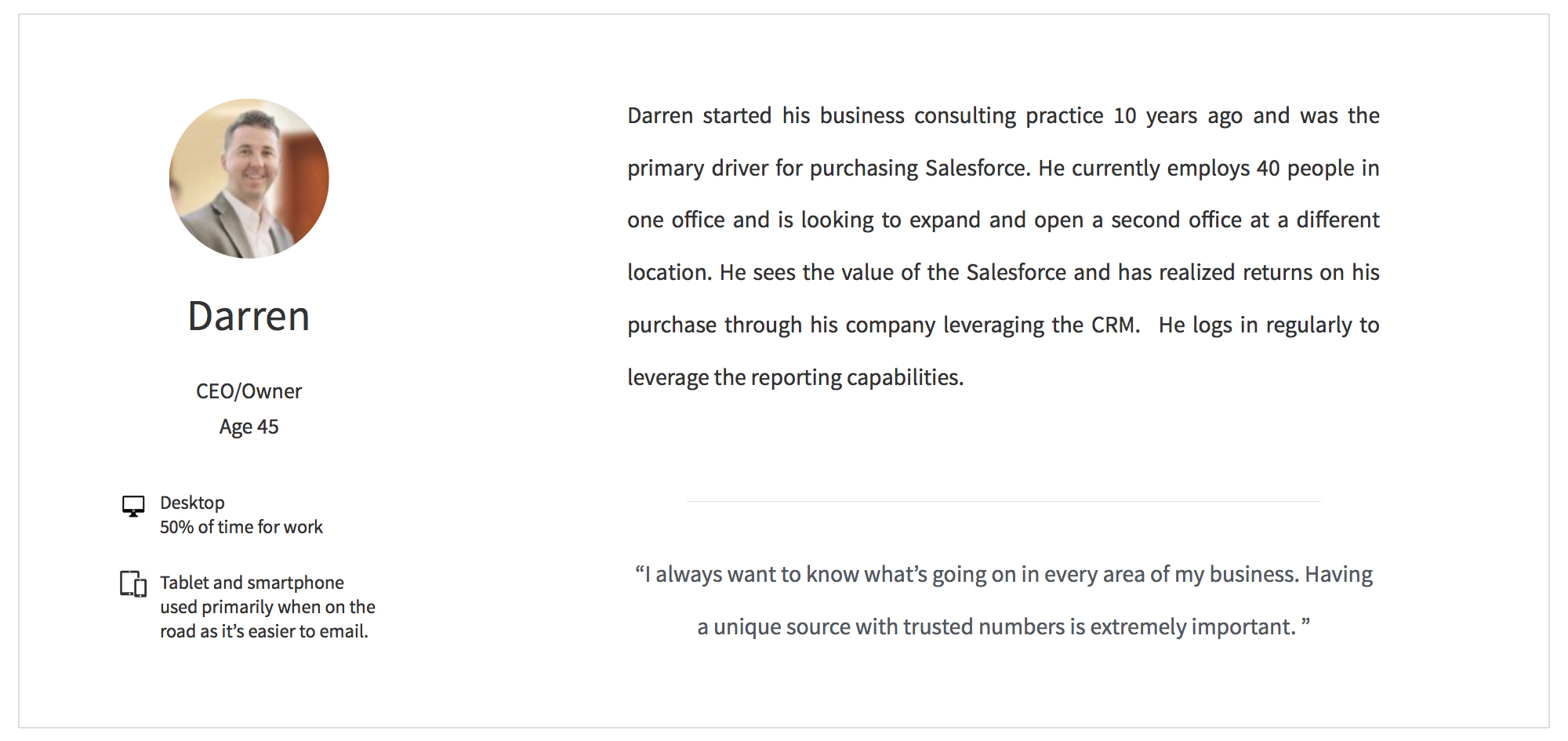
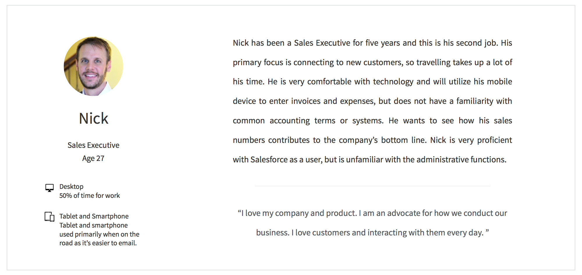
We faced some challenges on conducting user research and collecting feedback at first. We were not able to have as many participants as we initially aimed for. Thanks to our diligent User Research team, we were able to get enough participants and conducted interviews with real business owners and stakeholders. We used cognitive walkthroughs and heuristic evaluation to better understand user’s motivations. Results from these researches helped us gain insights into the wants and needs of our users and gave us a solid understanding of an efficient workflow.

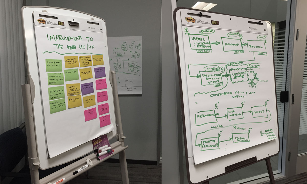
Photo by Ian Baldwin
USER EXPERIENCE MAP
We conducted user experience map to document experience from user’s viewpoint. It’s crucial and an incredibly useful technique to gain insights on how our users are using the products and services with break-down activities, list of relevant channels and touch points, customers goals and feelings.
This is also an effective way to minimize the risk of unintentionally turning the UX design into an internally driven process flow.

THE VISION
We envisioned this app to allow users to enjoy consuming accounting information on-the-go, help user to have more fun out of supposed tedious task. We wanted to inspire users to be always on top of their biz financial info.
LESS IS MORE
We prioritized our goals to be in-sync with user’s primary goals. We stripped away information that is not important and focus on efficiency and usability.
GOOD DESIGN MAKES A PRODUCT USEFUL
Beyond the key features, we strived to establish an emotional connection with our users. To build an understandable, unobtrusive and useful app is always our vision.
THE REQUIREMENTS
Making the app easy and intuitive was not the only goal.
We wanted to create an app that our users want to use. From our researches, we learned not only what the app should do, but also how it should feel by establishing an emotional connection. Being transparent from early design stage helped our core team understand the importance of beyond skin deep experience.
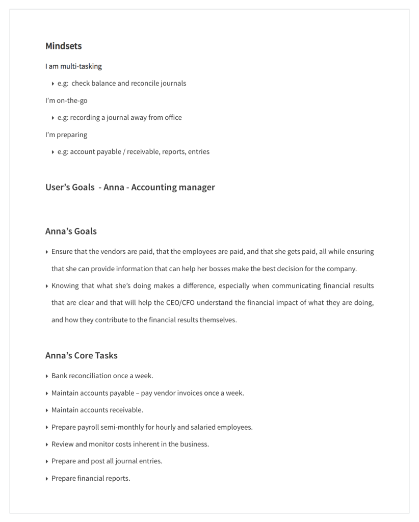
STORYTELLING ABOUT IDEAL EXPERIENCES
Throughout the design process, I kept asking myself how this app solves the real-world problems for our users, how this app makes their lives better. Knowing who will be using the app allowed me to focus and predict on personas’ behavior and cognitive walkthrough before dive into detailed UI and technical constraints.
Reiterating the high-level user scenarios helped us to convey and communicate design approaches within our own team as well as the client. They embodied the core value of the requirements and allowed us to establish emotional connection with the users.
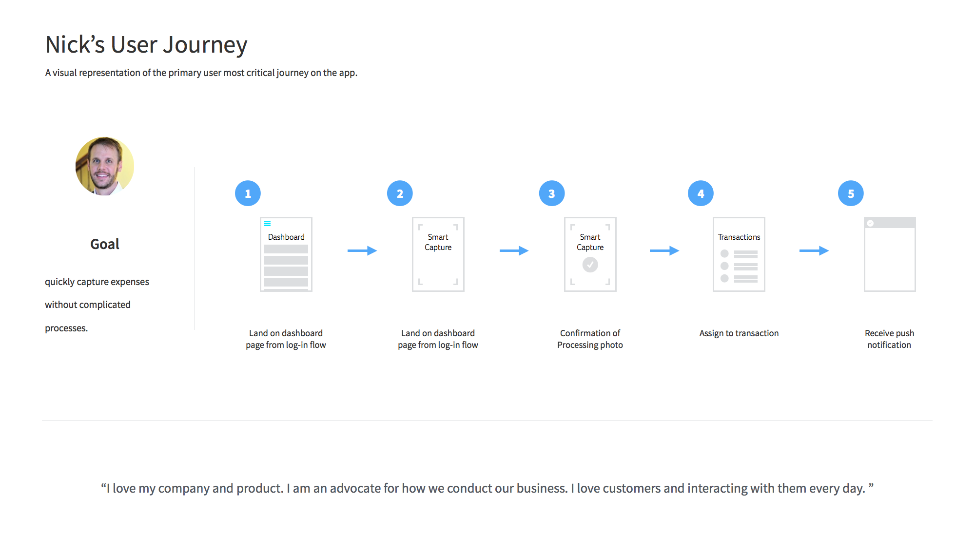
VISUALIZING FRAMEWORK
I created information architecture to bring coherence and allowed the core team to quickly understand structural hierarchy for approved content and functionality in the app.
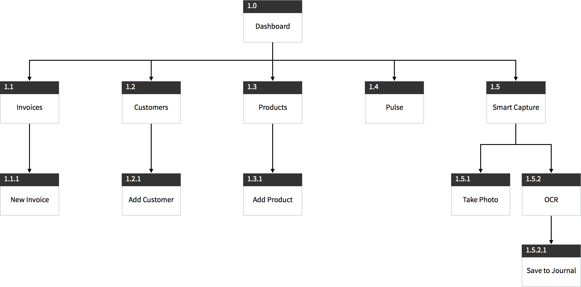
Information Architecure
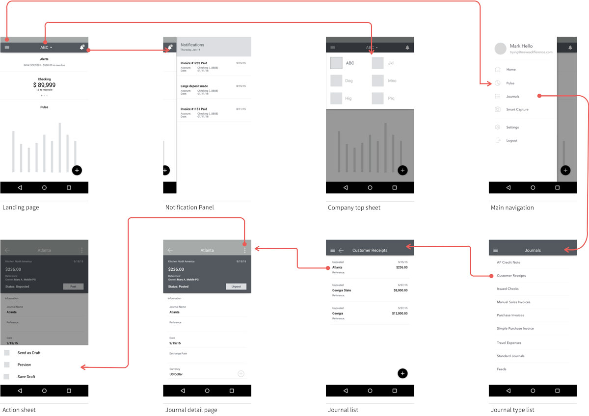
UI flow
THE INTERACTION FRAMEWORK
Invision is the go-to tool for me for rapid prototyping. I rely on it for communicating app’s interactions and transitions. Although some interactions are subtle and will most likely not be recognized by users. Still, I believe they are extremely crucial for engaging and reinforcing context. Static PDF / Slides will never achieve the same goal. Invision allowed me to quickly apply native interactive transitions to components without a sweat. However, it has its limitations, especially morphing effects. Therefore, I used ScreenFlow in conjunction with Invision to communicate Material Design transition more effectively.
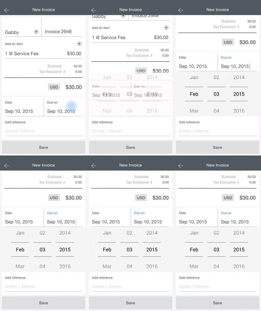
PROTOTYPING WITH AXURE RP
For some usability tests early in the process, we chose to develop high-fidelity clickable prototypes using Invision for the native Android part of the app, and Axure PR for the responsive web app pages. The most obvious advantage of high-fidelity prototype was that it allowed dev team to see and provide feedbacks to the more-polished design early on. On the other hand, stakeholders from cross-department became more and more dependent on high-fidelity prototypes and eventually requested design refinements to be reflected in the prototype as the final deliverable. It was less of the hassle on Axure to revise components as each components were modularized. Unfortunately, for visual reiterations on Invision, we had to update and re-upload each screen as most of them were just static images.
DETAILED DESIGN
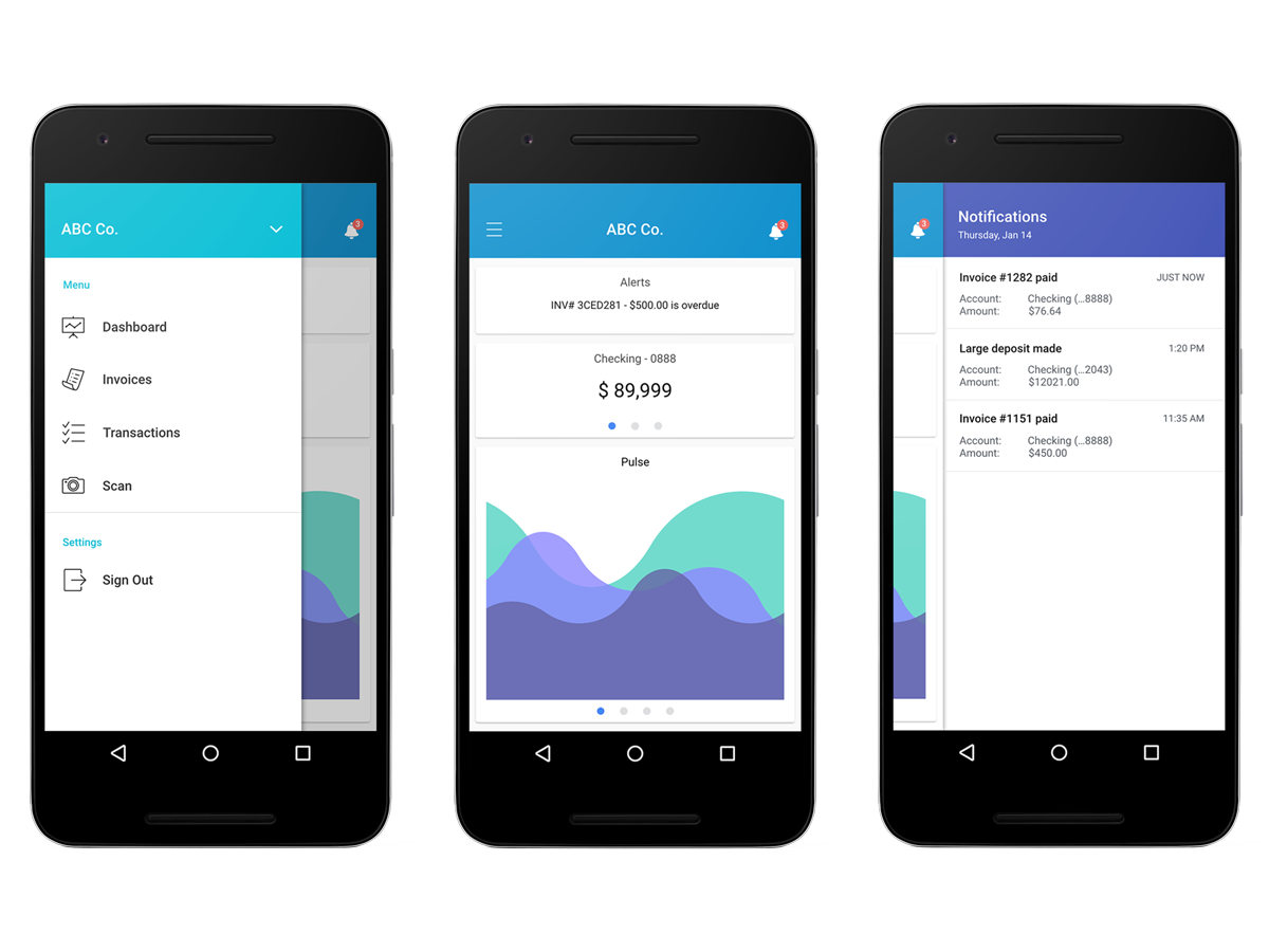
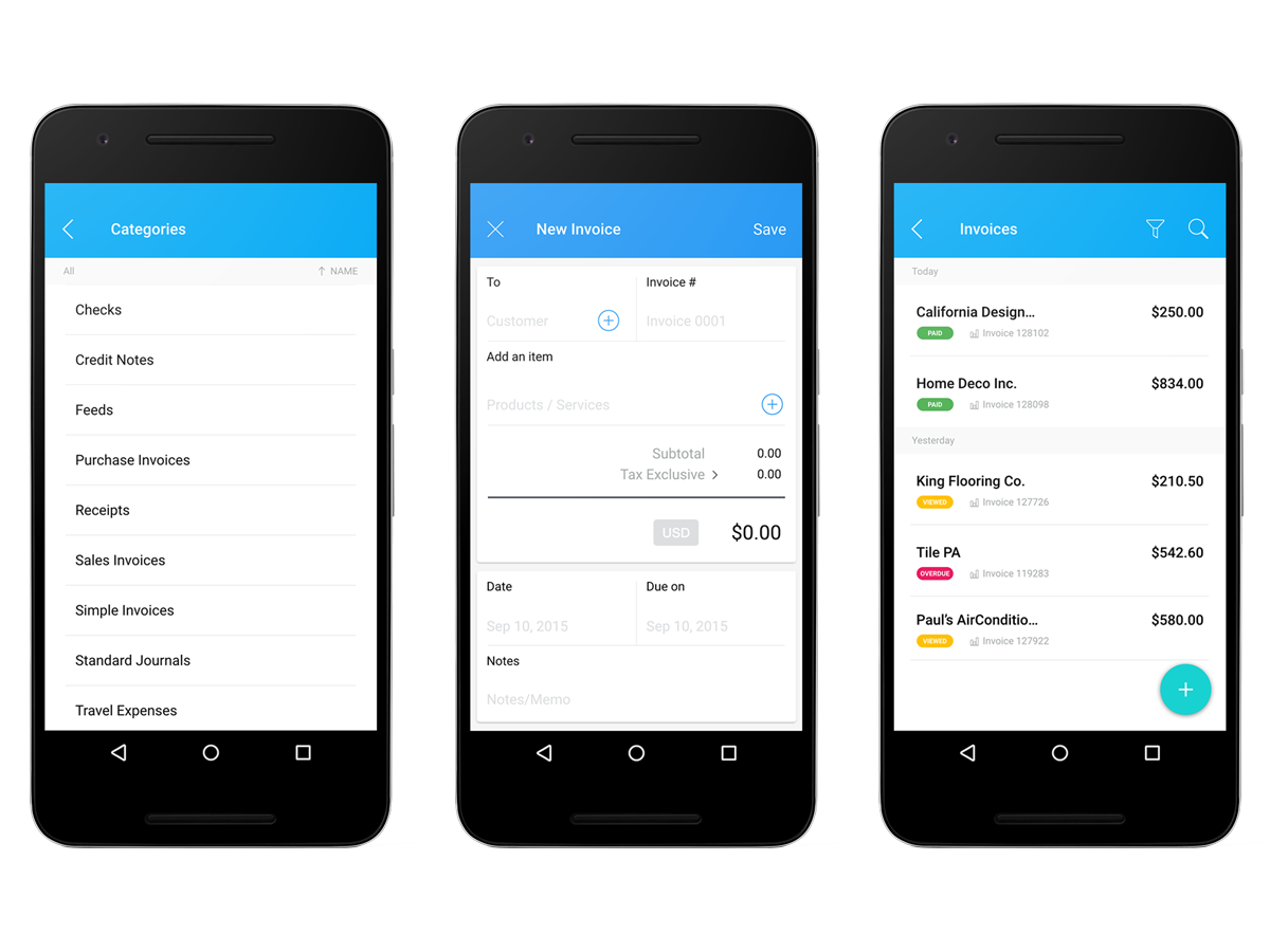
Photos below show the final Android app for launch.
MEANINGFUL INFO AT FINGER TIP
The dashboard is designed for user to quickly scan through the screen, interact with curated information and access to primary functions.
Information are organized into card collection. A card is a sheet of material that serves as an entry point to more detailed information. The size of each card are optimized for easy tapping based on Scott Hurff’s study on thumb zone reachability. Content hierarchy was used to direct users’ attention to important info and we emphasized the primary content with typography treatment.
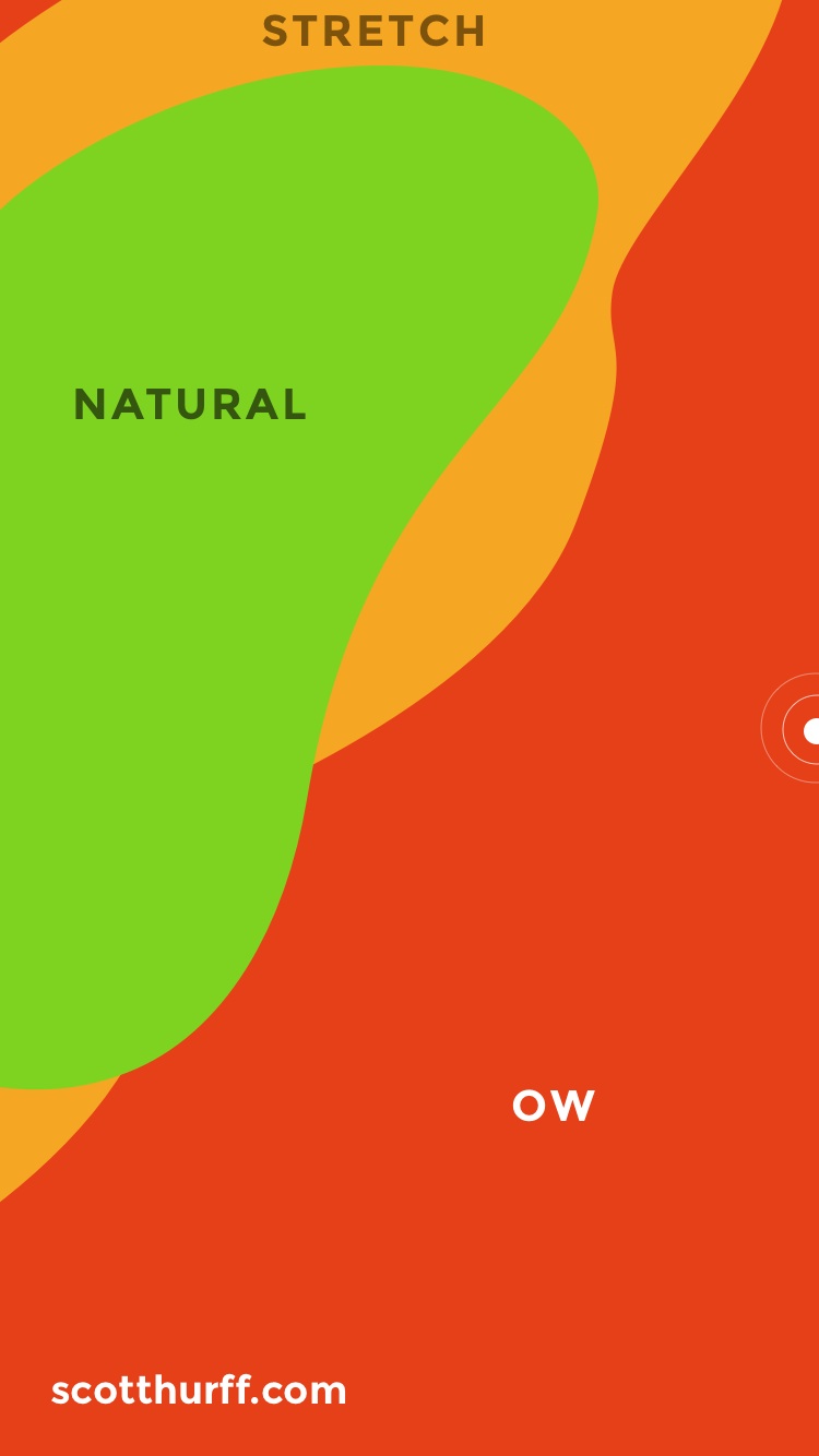


Thumb Zone templates created by Scott Hurff
MINIMIZE LEARNING CURVE
Designed to empower users on-the-fly, users can rely on gesture affordance they have already developed from using Android OS, thus there was little-to-none learning curve for actions.
DESIGNED FOR JOY
The design is simple, clean, well spaced and optimized for legibility.
The interface design adapted vivid colors with good contrast and endorsed fun-ness through the app. Text information have great readability while graphical elements and IxD infuse delightful moments.
THE REFINEMENT
UX with U(ser) in mind
We worked closely with our usability research team led by Abby to help refine objective and evaluate the app. In order for us to obtain the most pragmatic feedbacks from testers, we moved from using prototype to a beta version of the real application. Like how smartphone makers test signal reception, there is no way to test the signal strength completely in labs, they had to take the phones outside and tested in real world. We were able to reveal issues for: stability, loading, processing delay due to less-optimal signal, affordances and info grouping.
MAKE USERS FEEL SMART, NOT THE OTHER WAY
From participants we were able to reinforce our concerns that most people are puzzled by the accounting jargons. Even the most basic ones that accountants assumed everyone knows: reconcile, matching, tagging, posting rules, dimensions to name a few. Users were emotionally disconnected. The alienating terminologies failed to convey affordance and made users felt they were not smart enough to use the app.
To improve usability, we swapped out all confusion-prone terms with plain English (local language for oversea launch), which proved to engage users and establish emotional connection with crystal-clear meaning.
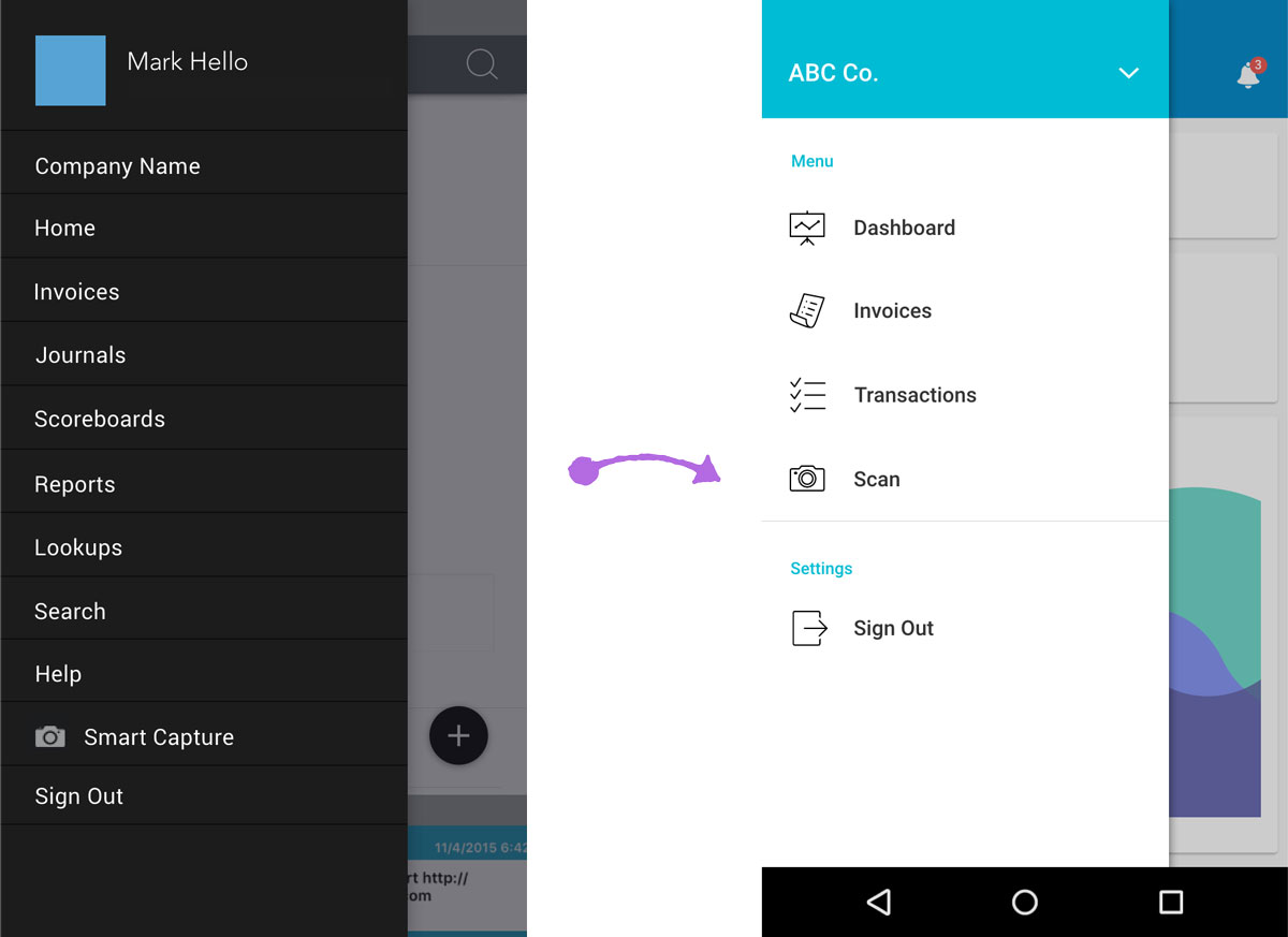
Before vs. After
CROSSING OUT THE CROSSHAIR
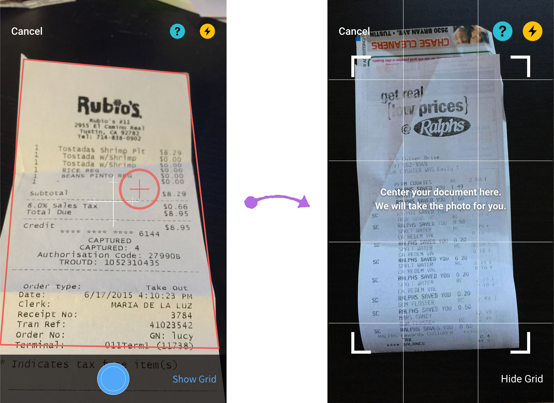
For our Smart Capture feature using Optical Character Recognition (OCR) technology, we observed that users had trouble understanding the UI that were supposed to aid them to take better photos quickly, and were overwhelmed by all the progressive indicators on screen. This is because our app requires camera to be held directly over the document from a reasonable distance. To help users, we removed the crosshair as it misrepresented the feature. We do not need user to pick a focal point for the document they are taking photo of, which crosshair is meant to be, instead users just need to make sure the content is within the boundary indicator, and when the text are sharp enough to be picked up by OCR algorithms, photo will be taken automatically with vibration feedback.
Furthermore, help-tip message bubbles in to provide contextual tips, and help page will slide in after 5 sec or 2 failed attempts to minimize guessing.
